Aiming for the stars

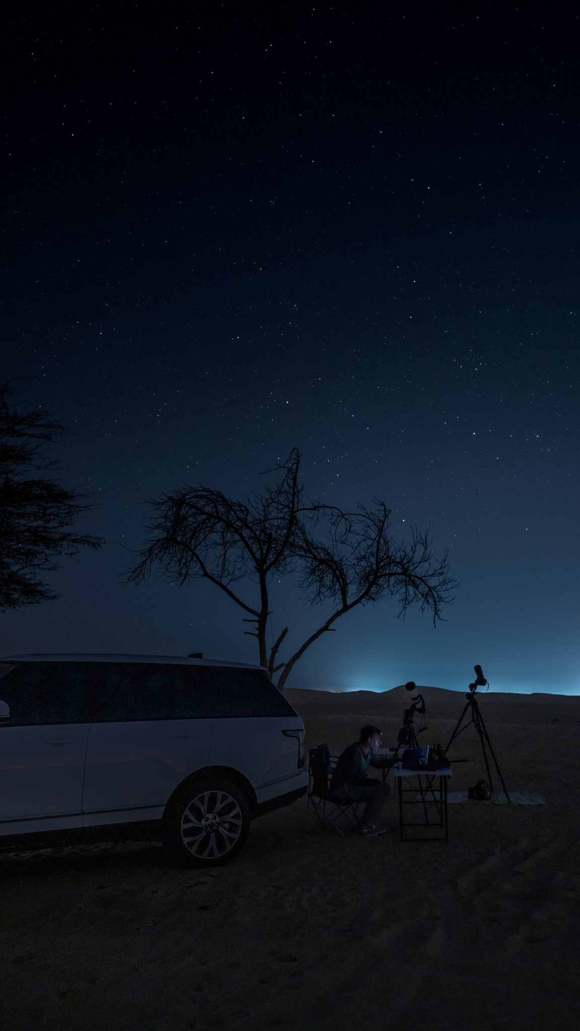
Self portrait…toiling under the cool starlit sky.

I’ve always been interested in space and astronomy, so it was only natural that I would eventually discover a hobby that lets me combine three of my passions: space, photography, and computers. Modern Astrophotography has a healthy does of all three elements, making it both appealing and challenging.

I started this new hobby at the beginning of this year, not ideal timing considering the movement restrictions that were soon put into place due to the COVID-19 pandemic. Having said that, being forced to practice from home under the hazy light polluted skies of downtown Dubai in the summer certainly accelerated my learning curve. However, before the restrictions came into force I was able to experience a few evenings of Astrophotography under the darker skies of the Al Qudra Desert about 45 minutes from home.

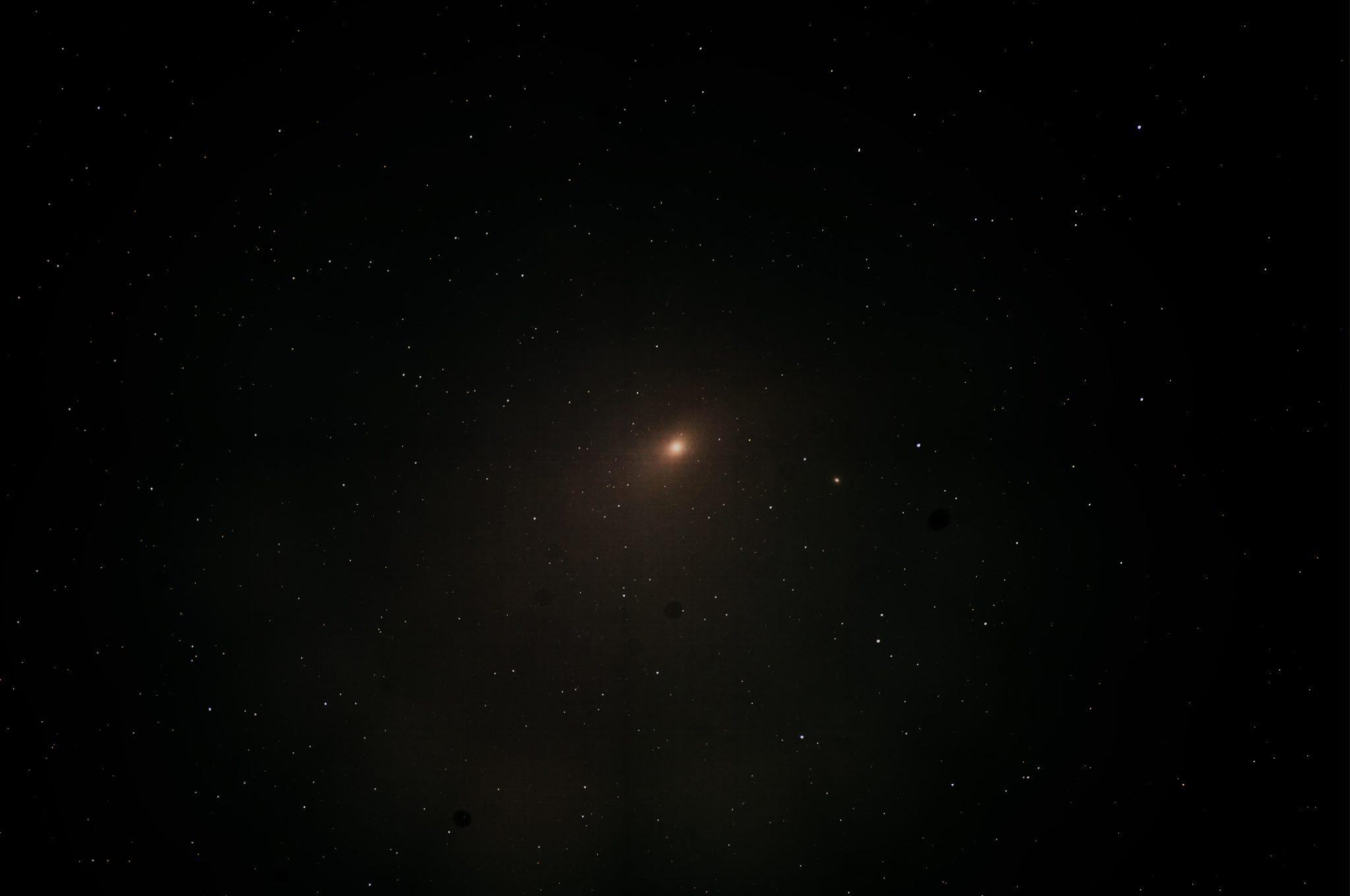
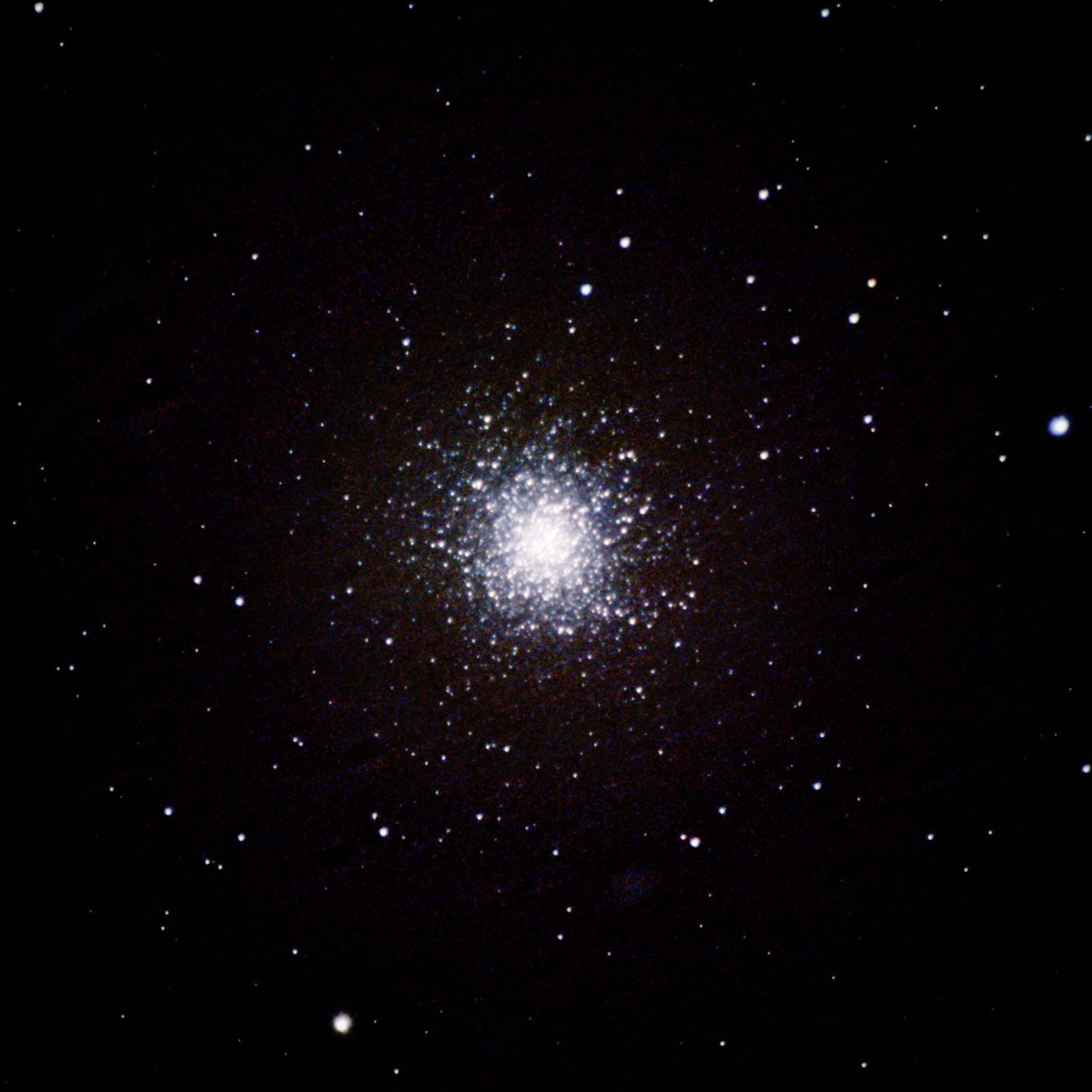
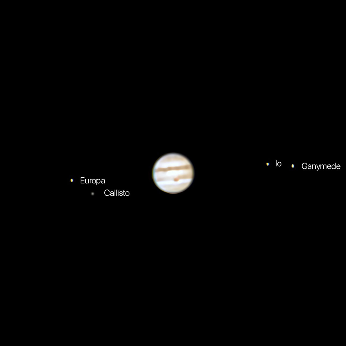
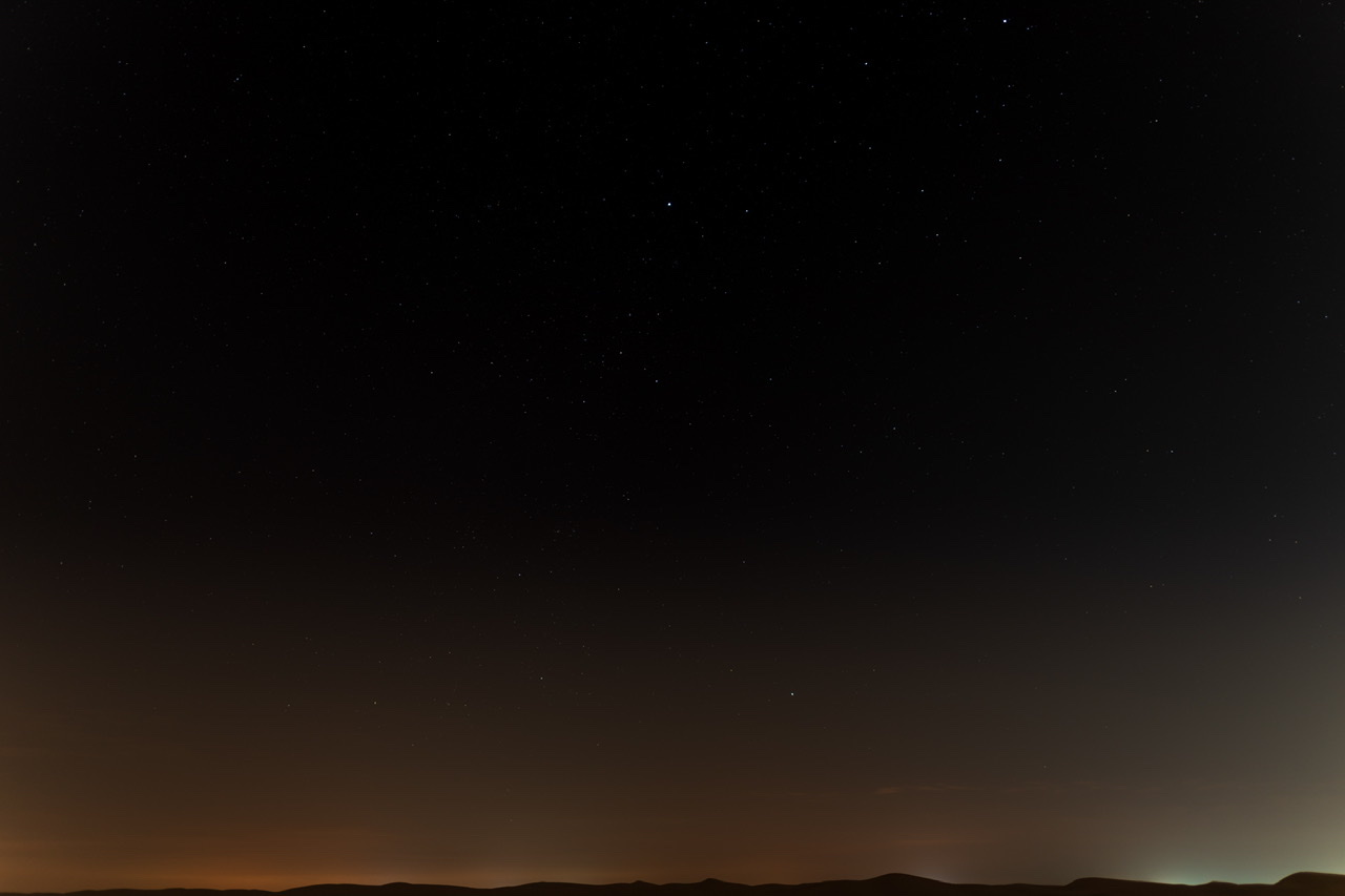
My first outing was spent trying to find the right spot to take the photos, figuring out how to setup my equipment in the dark, and pointing the camera up at the sky and seeing what happened. As you can see from these images below, they were pretty bad, but I was still intrigued enough to make a second attempt a few days later.
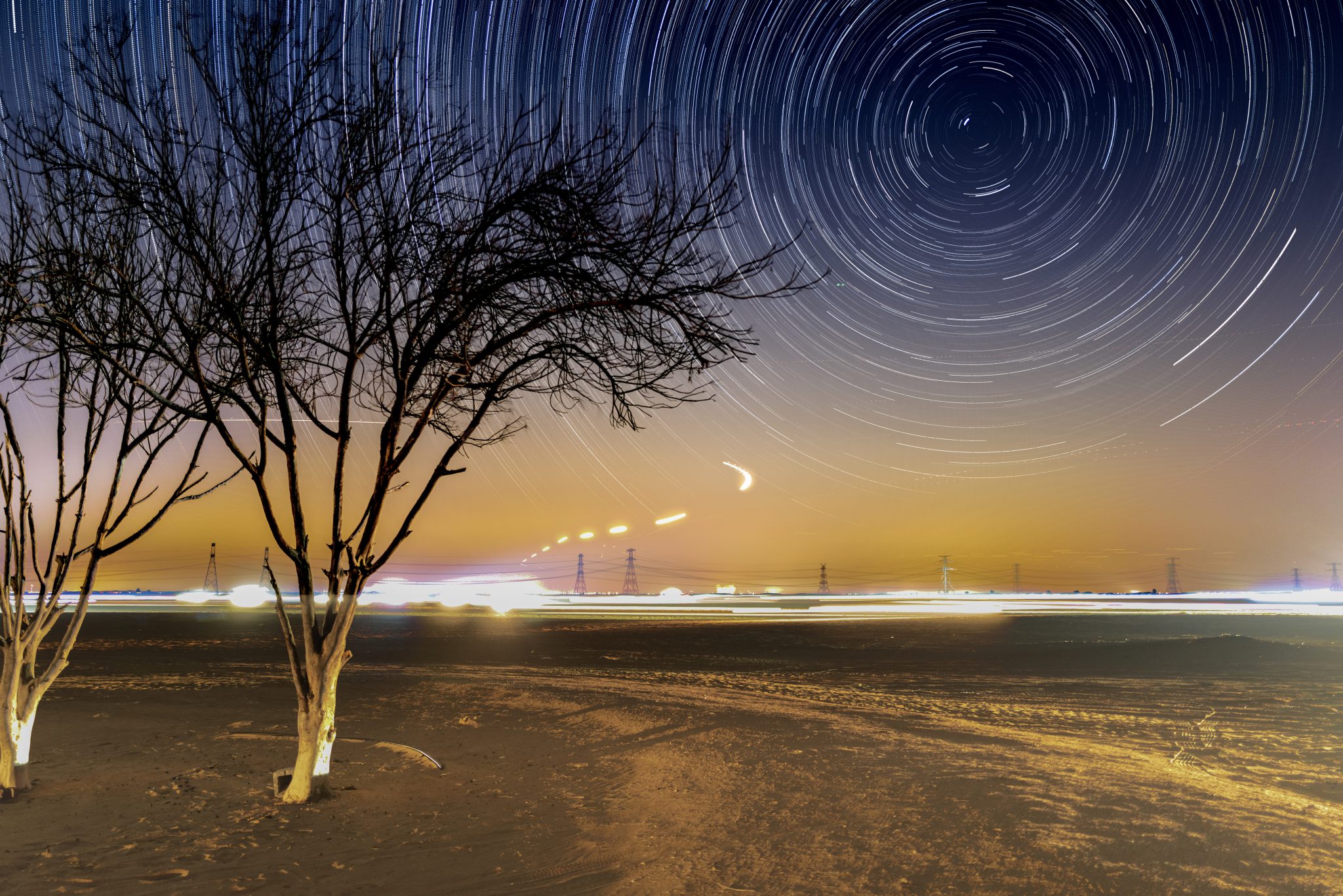
On my second outing I concentrated on capturing star trails. The basic idea is to use a wide angle lens and capture a long exposure of a starry sky to create trails as the Earth rotates. This image below was captured using my Leica Q2 with a fixed 28mm ƒ/1.7 lens. I captured nearly 200 exposures of 20 seconds each and then used a Mac application called StarStaX to combine the exposures into a single image, while enhancing the star trails themselves. This was necessary because this camera has no way to disable Long Exposure Noise Reduction (LENR).

Composite photograph of star trails taken from the Al Qudra Desert on the outskirts of Dubai
My first proper star trails photograph

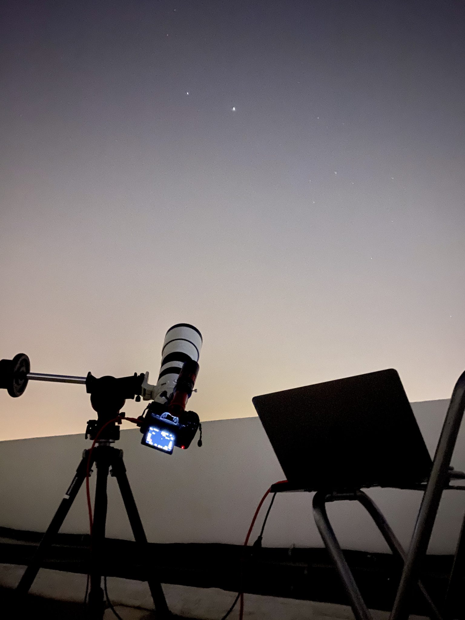
Here’s a photo of the fairly basic equipment setup I used to capture this image:
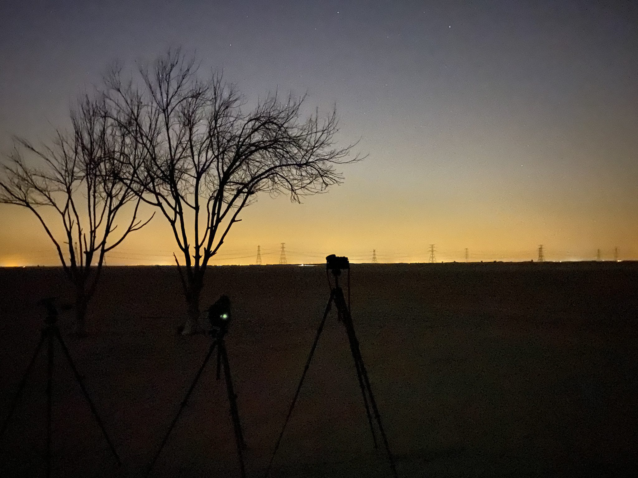
Photography equipment setup to capture star trails
To capture star trails all you need is a camera (or smartphone) with a wide angle lens, a good tripod, and a dark cloudless sky.

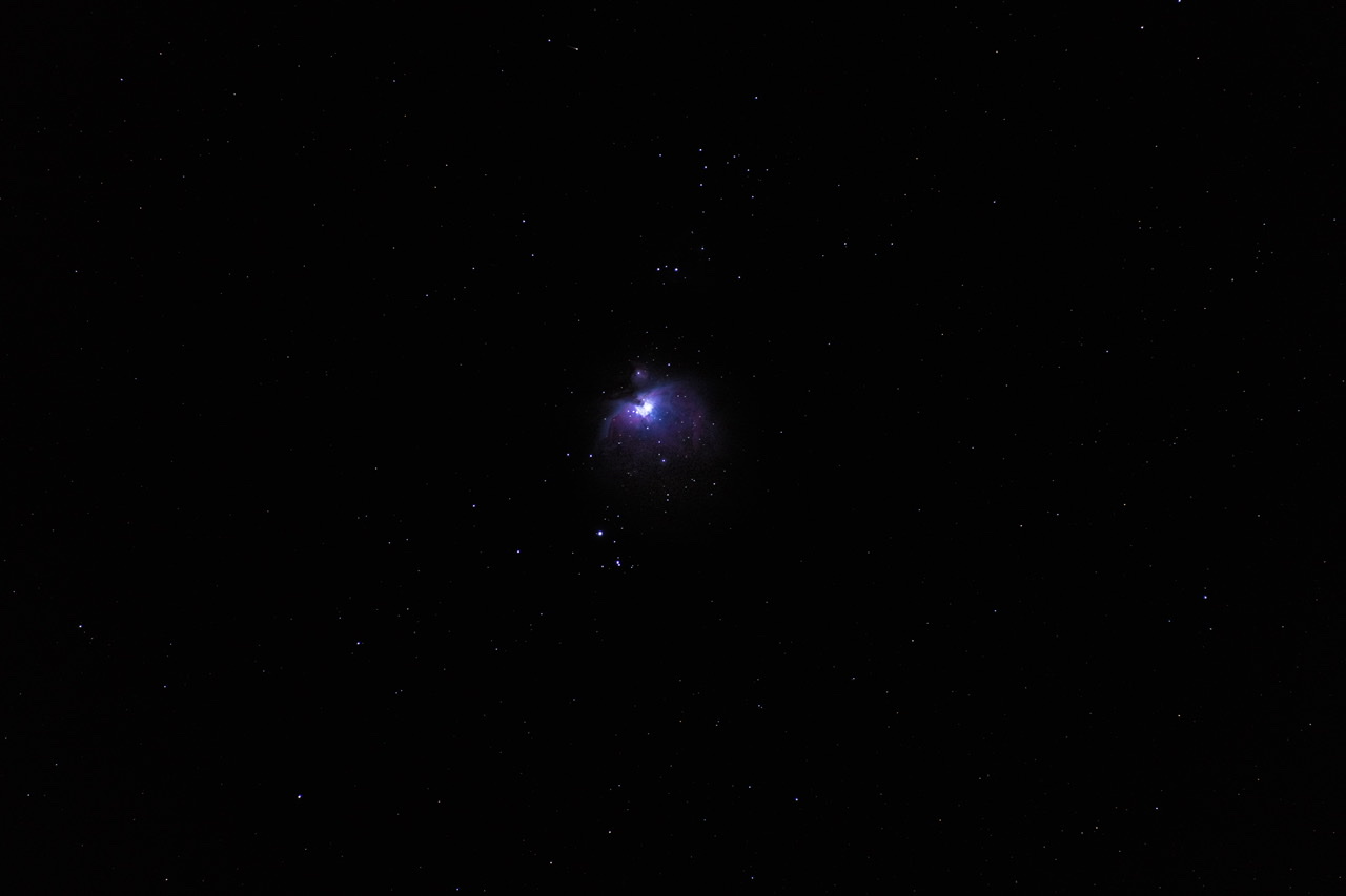
I was also keen to try my hand at photographing deep sky objects (DSO), such as the Orion Nebula. The great thing about this DSO is that it is large and bright. So much so that even from light polluted downtown Dubai you can just make it out with the naked eye. From the desert, it is quite easy to photograph without any specialised equipment. In my case, I used a Sony α7R IV mirrorless camera, a Sony FE 200600mm F5.6-6.3 G OSS telephoto lens, and an iOptron SkyGuider Pro star tracker mount. The star tracker corrects for the rotation of the Earth and allows me to take longer exposures of deep sky objects.
With the help of a friend who had more experience than me, I was able to capture the following image of the Orion Nebula on my second outing:
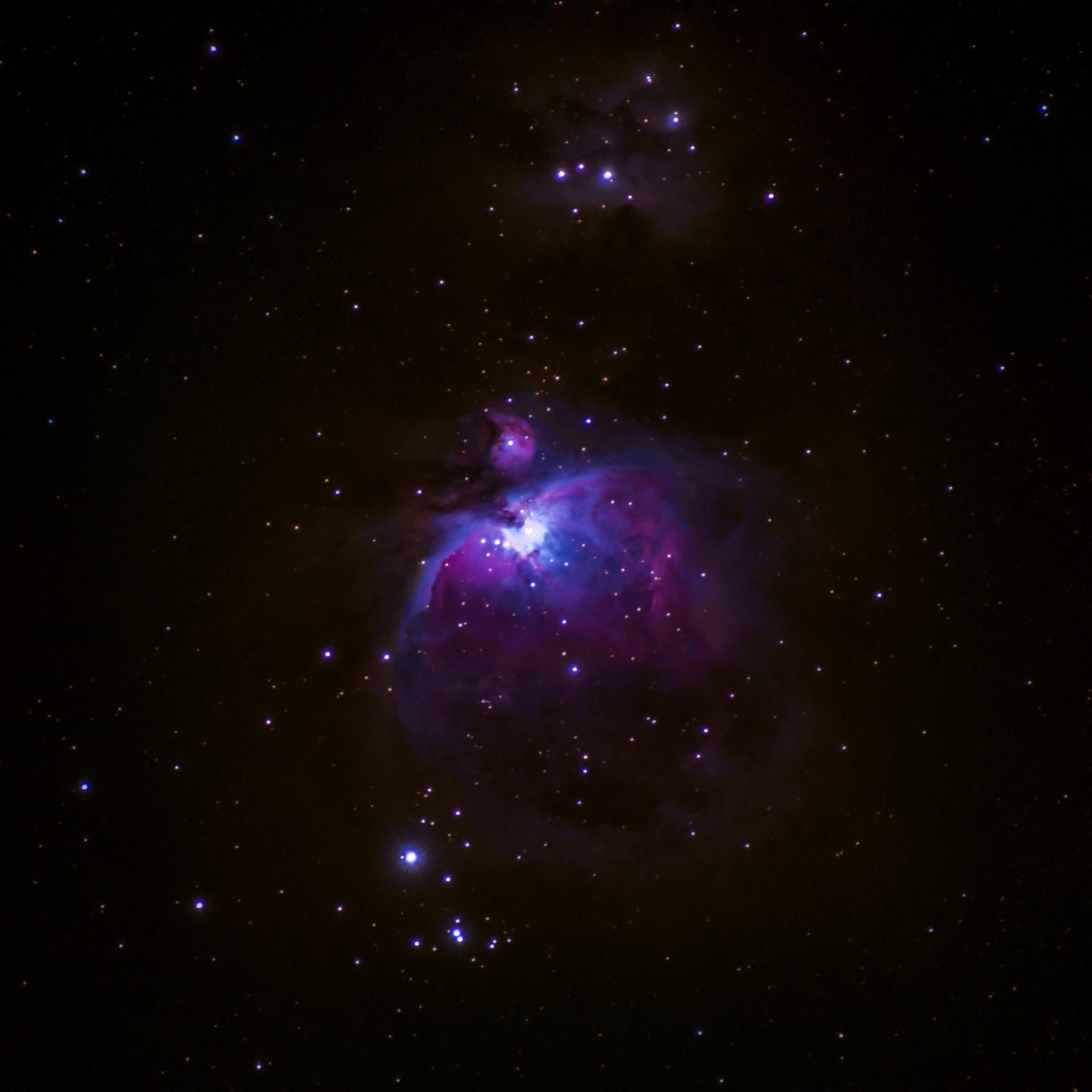
My second photograph of the Orion Nebula. This particular photo was taken using a star tracker and 600mm lens, and is composed of multiple shorter exposures (25 seconds) stacked together.

A few more weeks of practice led to the following image of Orion Nebula taken with the same equipment, but with better settings, more total exposure time, and better post processing techniques:
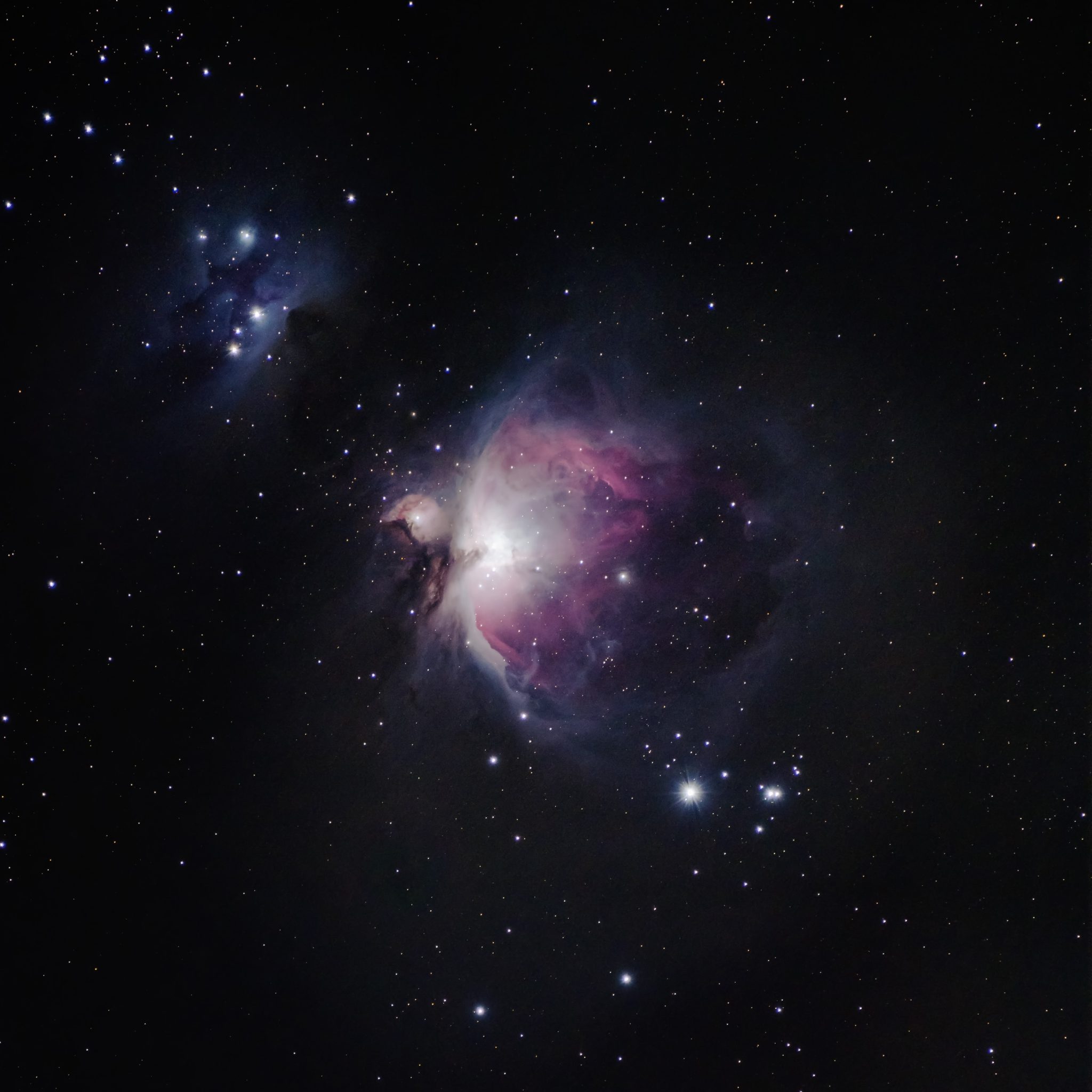
My best photo of the Orion Nebula so far. This photo was taken five weeks after my first attempt, and is composed of 40 exposures of 60 seconds each stacked and processed in Photoshop.

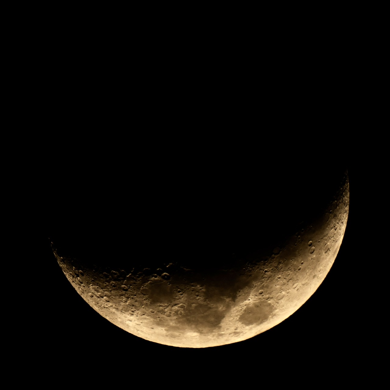
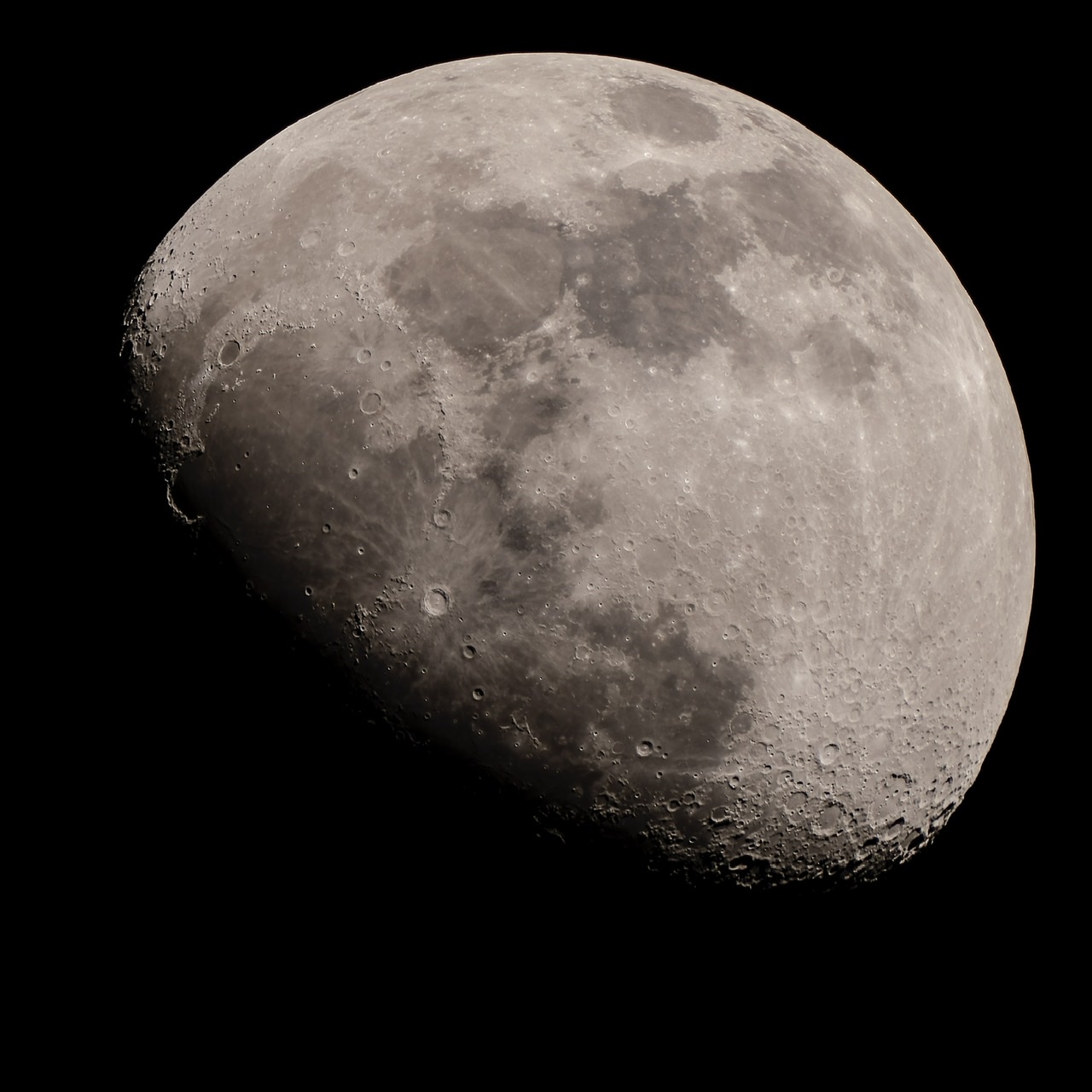
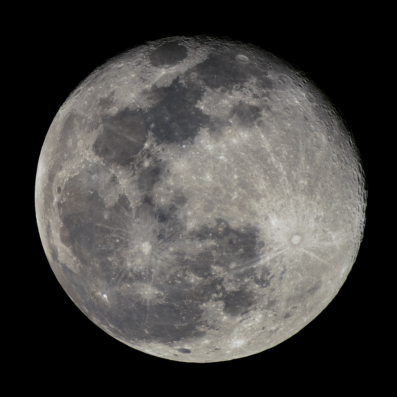
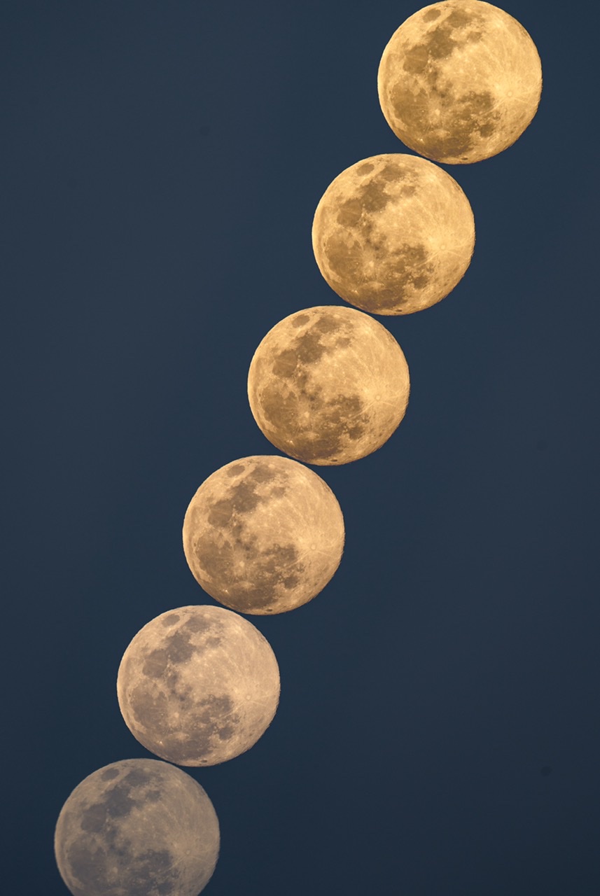
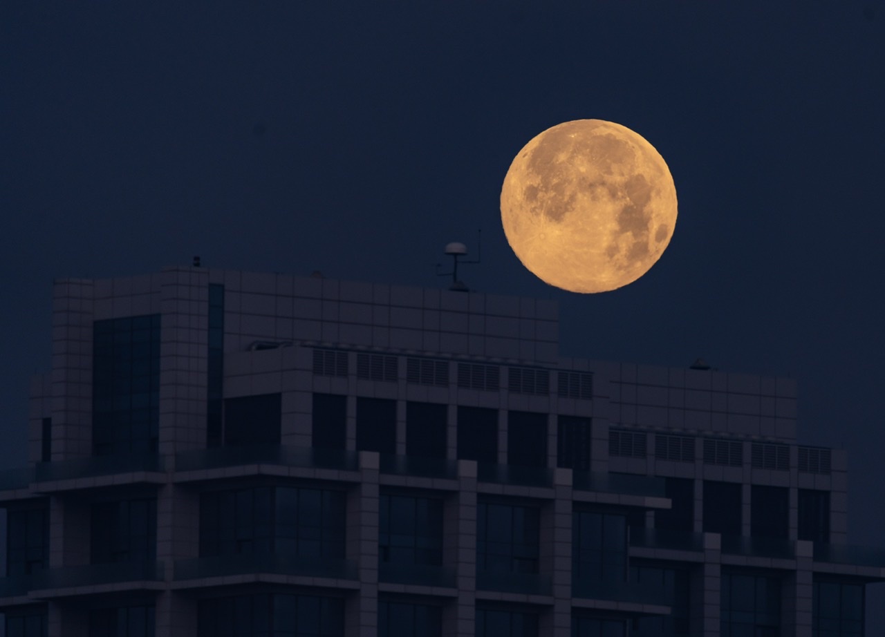
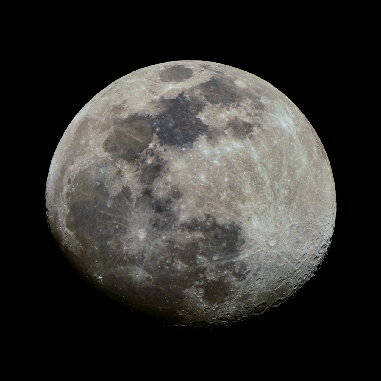
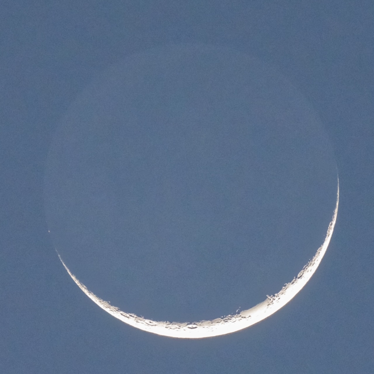
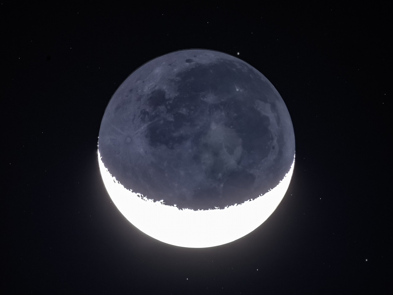
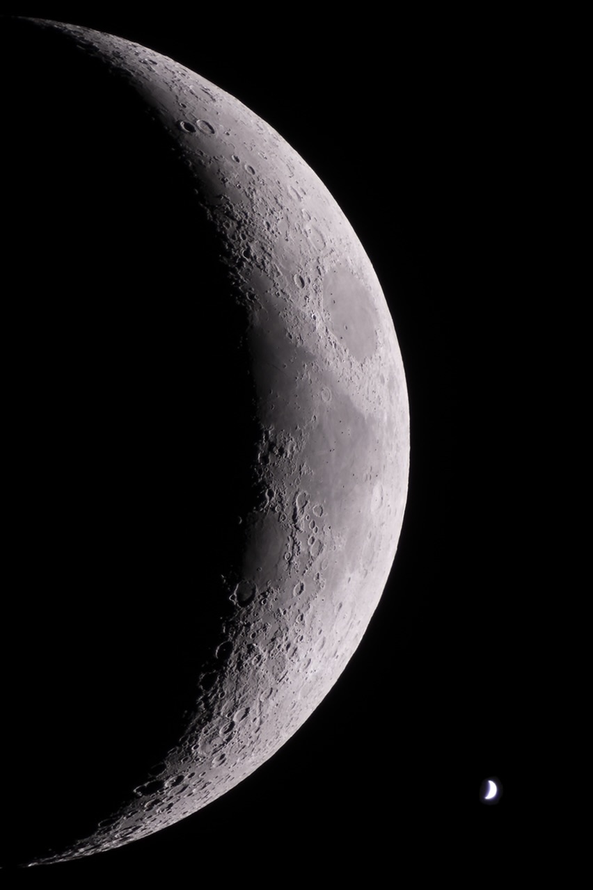
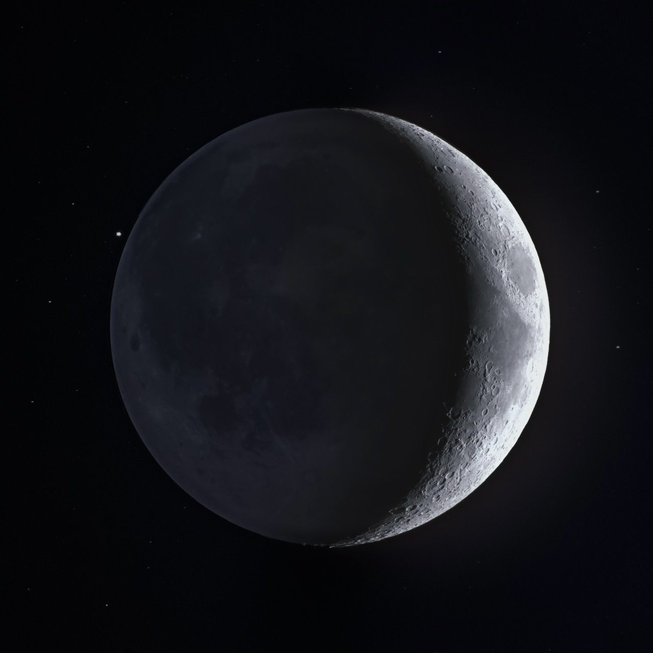
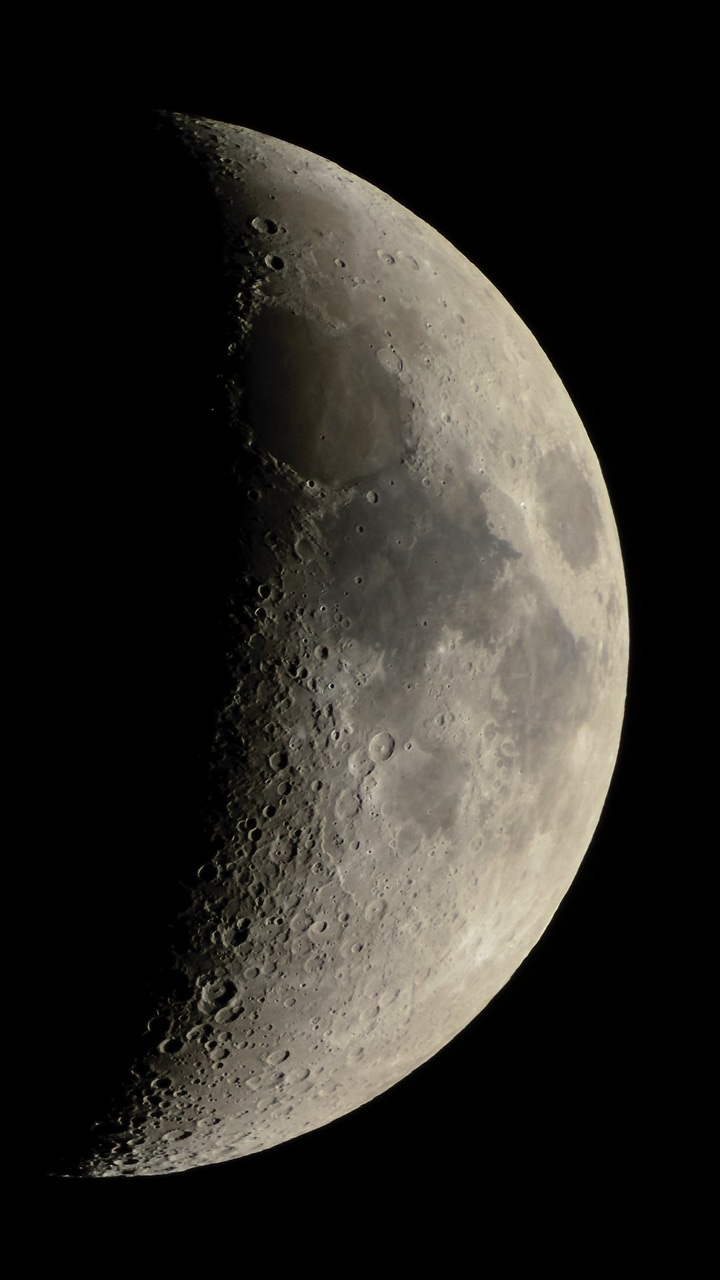
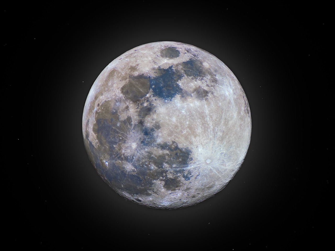
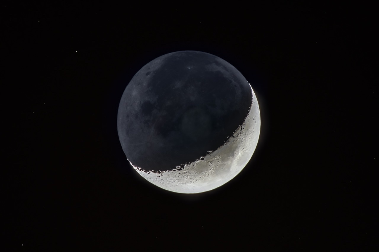
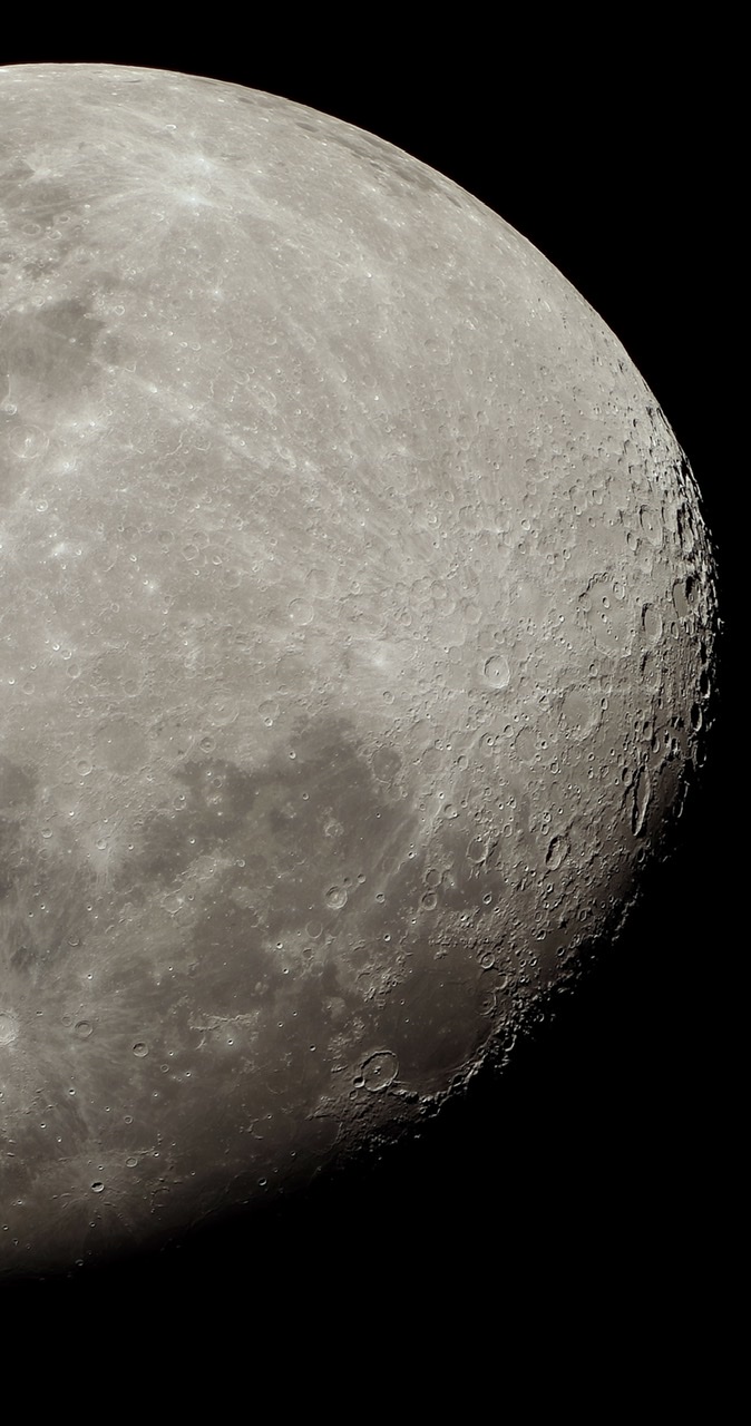
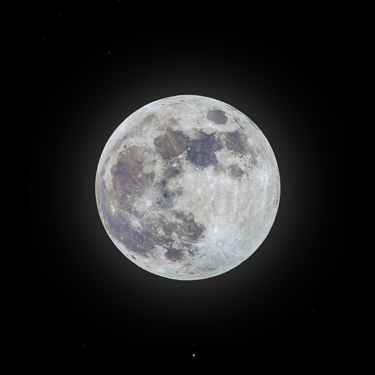
Once lockdown was in full effect in Dubai, I continued shooting night sky photos as best I could from my roof. The Moon is easy to photograph even in light polluted skies, so I took a lot of different types of moon photos:

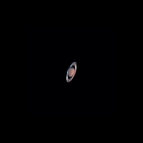
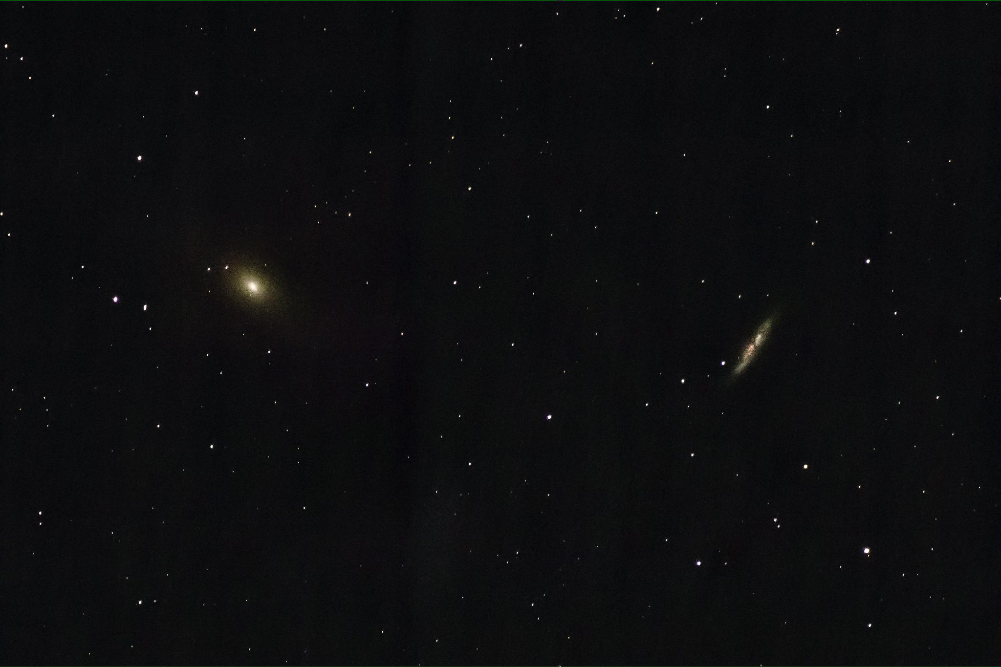
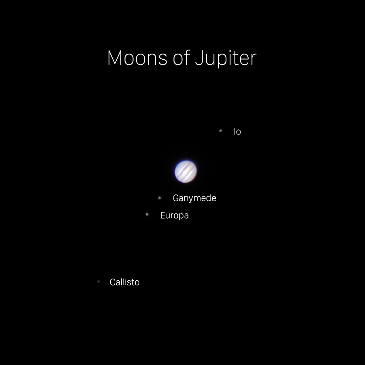
In addition to lunar photography, I tried my had at shooting the planets and DSO’s with limited success because there was too much light pollution, weather conditions were not great (hot, humid, dusty summer nights in Dubai), and my camera lens is not suitable for these types of targets. They really require a proper telescope and GoTo equatorial mount to shoot well.
In addition to photographing the night sky, I had the opportunity to photograph a partial solar eclipse in June. It was more challenging than I expected, and I wasn’t as well prepared as I thought I was. Some of the assumptions I made regarding camera settings, using a WiFi connection to control the camera from inside the house, and the extreme summer heat meant that I missed some of the photos I hoped to capture. Having said that, I’m still pleased with the final result and am looking forward to photographing a total solar eclipse at some point in the future.
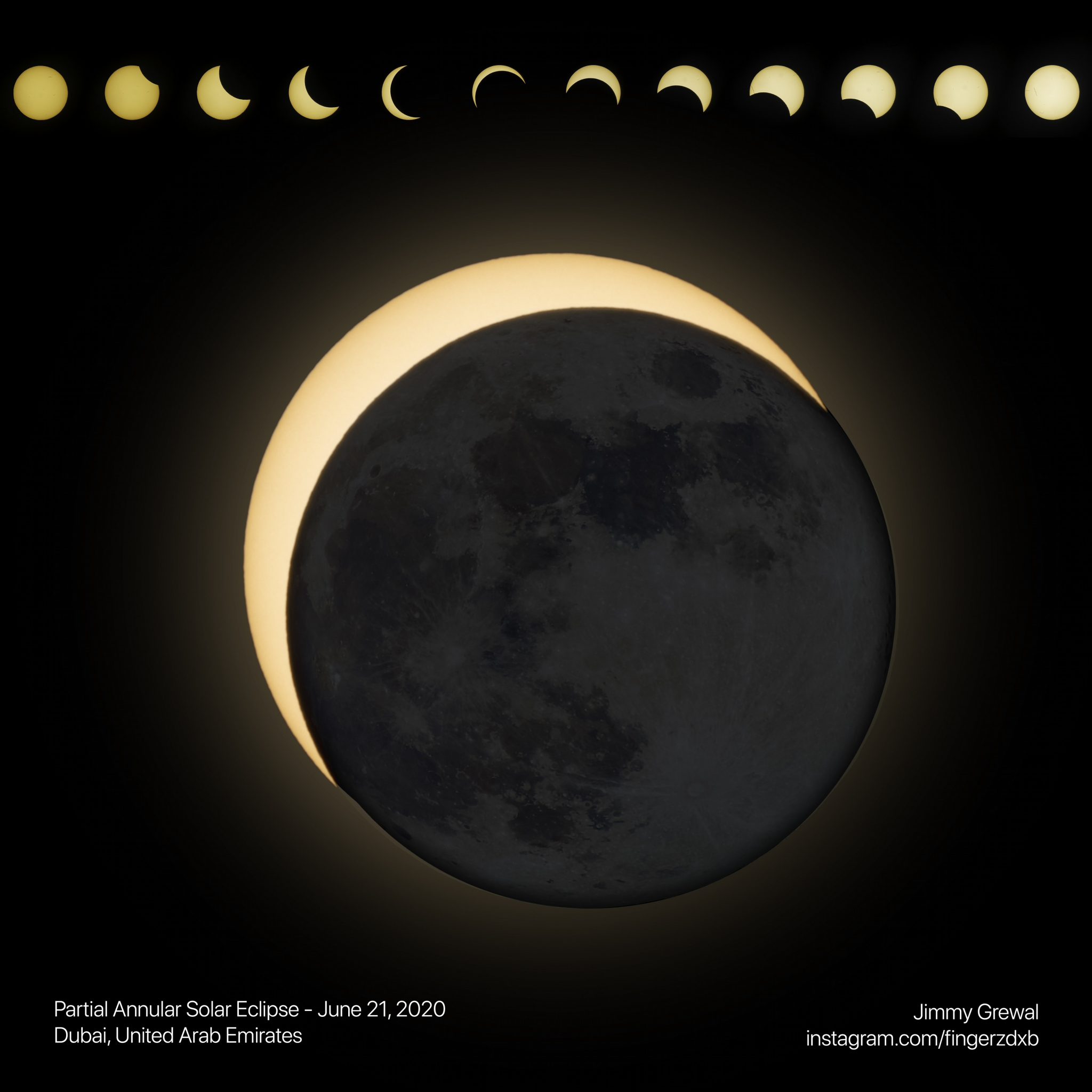
Composite image of the 2020 partial annular solar eclipse as seen from Dubai.

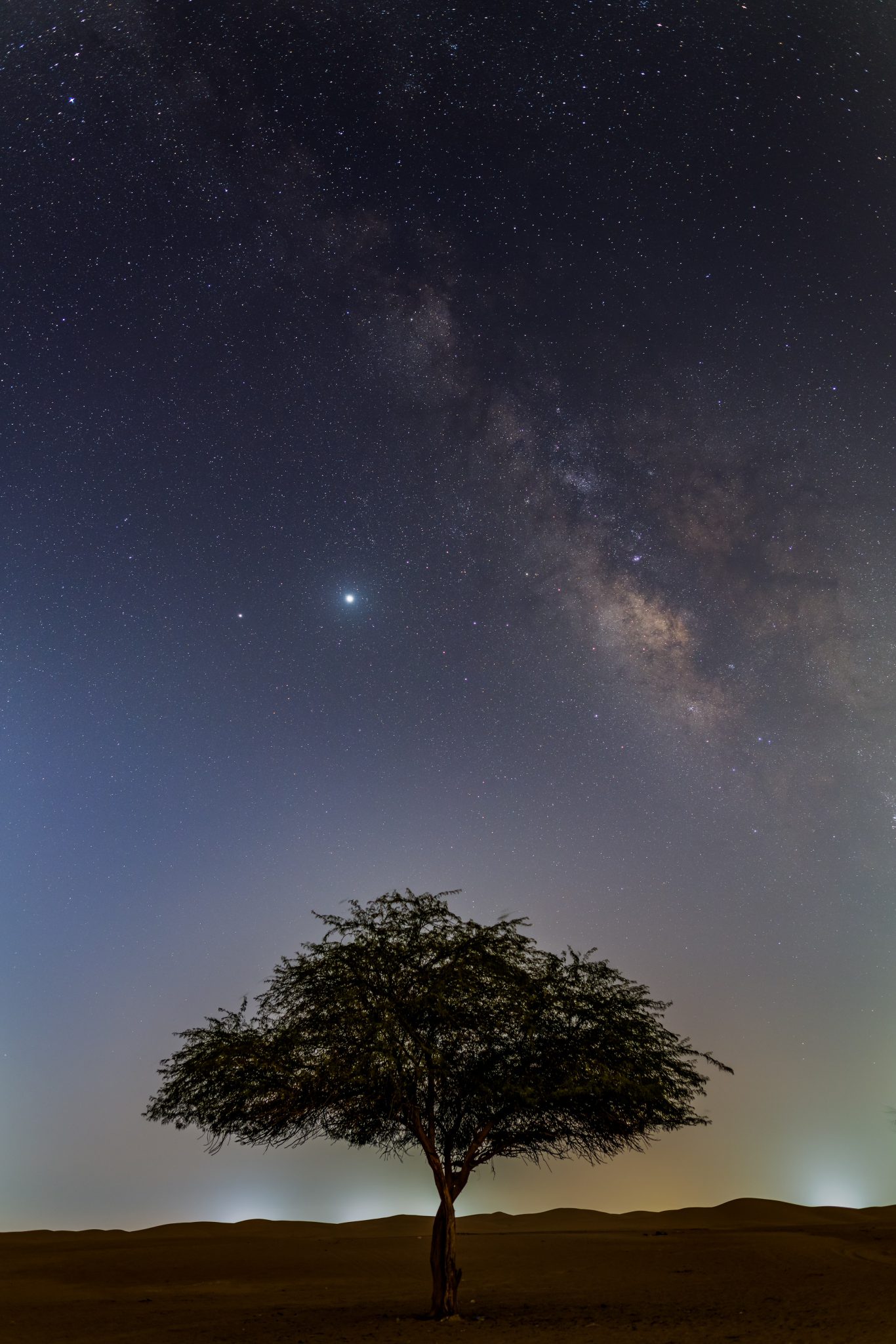
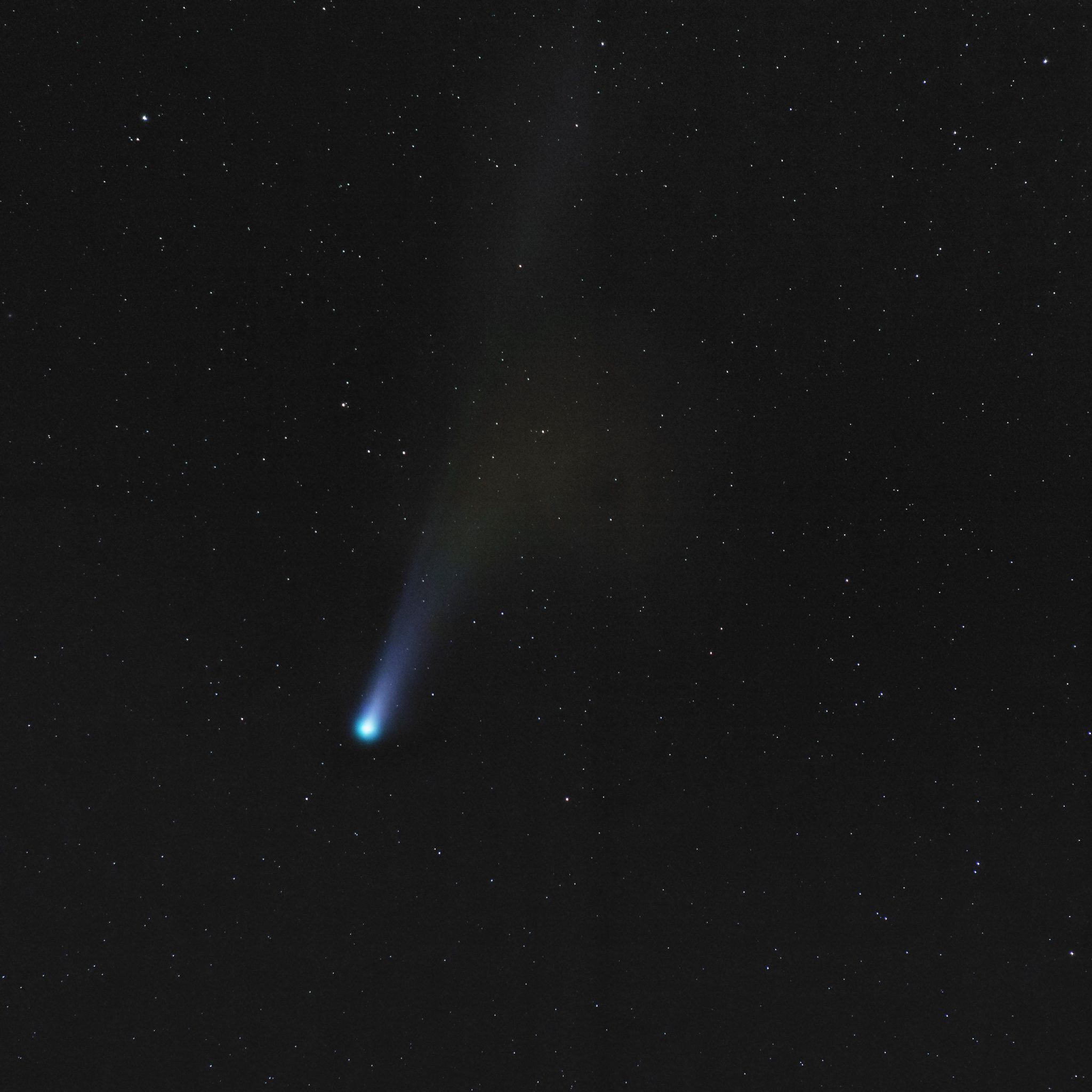
Late last month (July 2020), I finally had the opportunity to photograph two things that I have always wanted to capture: the Milky Way and a comet. In fact, I was able to photograph both on the same night, again from the Al Qudra Desert not far from my house. In both cases, this was not the ideal location to shoot from. Al Qudra is too close to downtown Dubai to have the totally dark skies that Milky Way photographers seek out. The other challenge was that this was one of the last days that comet Neowise would be bright enough to photograph “easily” and as it turned out the dust and city glow on the horizon were worst than I had hoped.

Nevertheless, the ends result in both cases was a pretty good first attempt…if I do say so myself. The experience has rekindled my interest in Astrophotography and I’m looking forward to the next moonless night later this month to try and photograph the Milky Way again. The ideal location in the UAE is the Al Razeen area of Abu Dhabi, but COVID-19 related travel restrictions between Dubai and Abu Dhabi remain and I’ll have to make do with some of the dark sky spots here in the Northern Emirates for the time being.
The rarest production Macintosh finally added to my collection

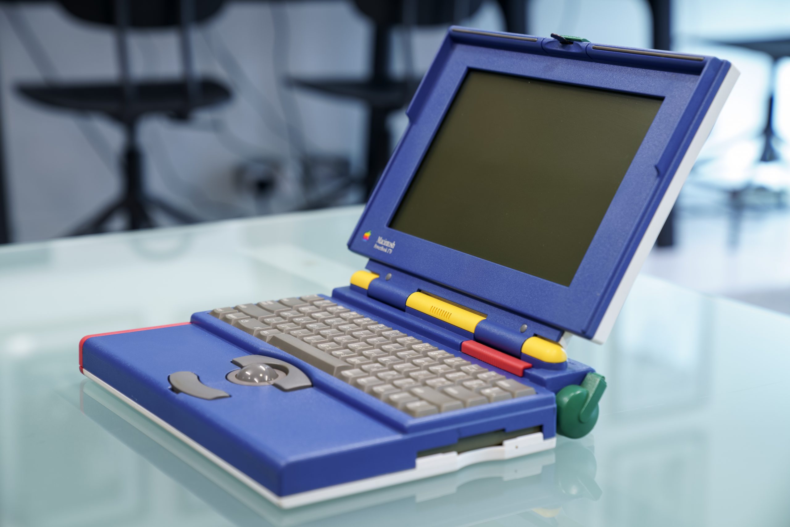
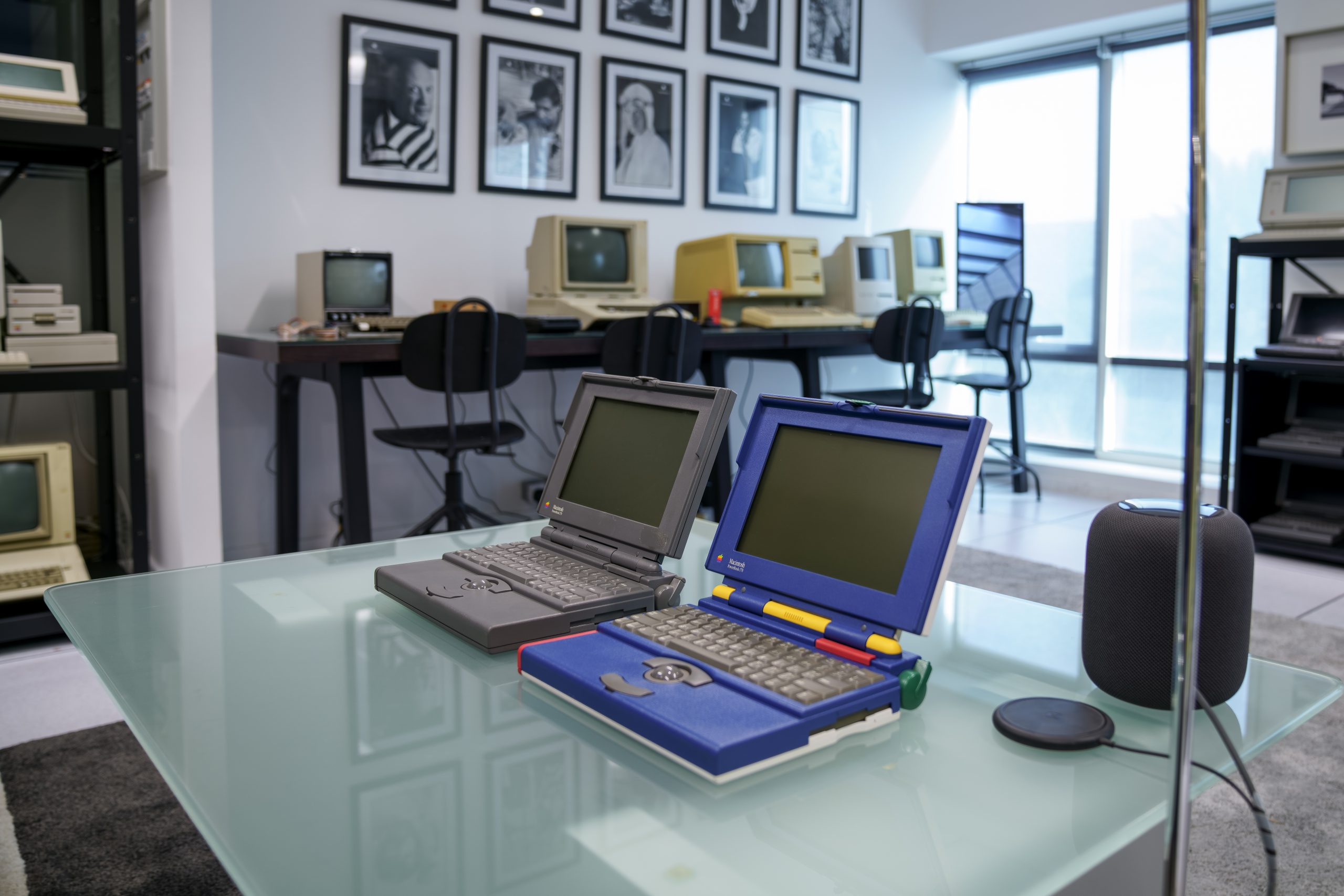
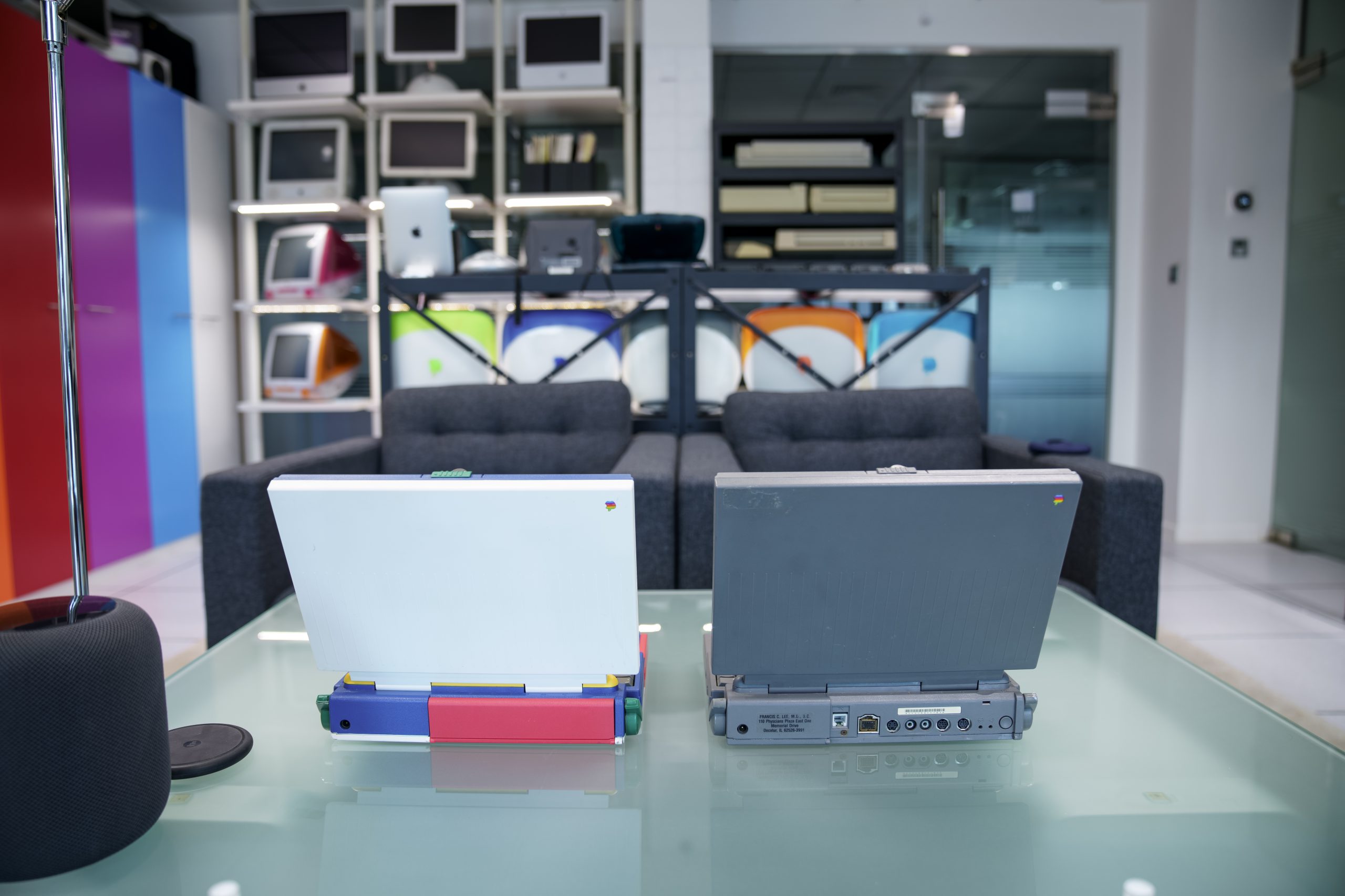
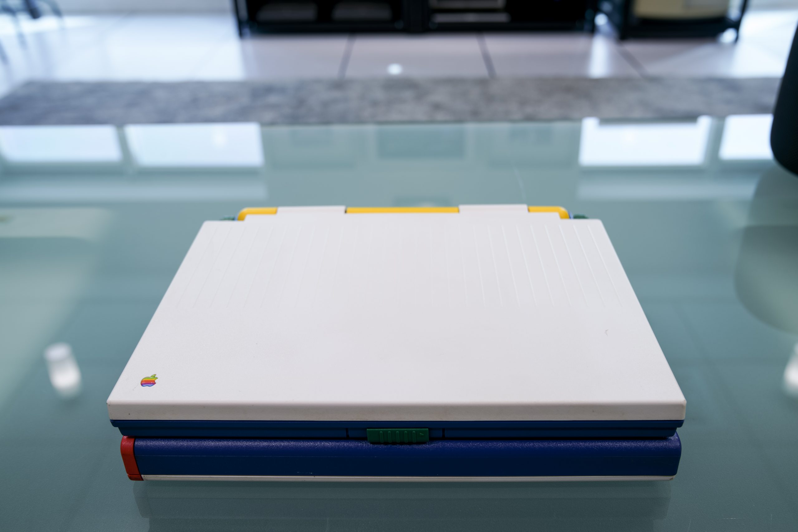
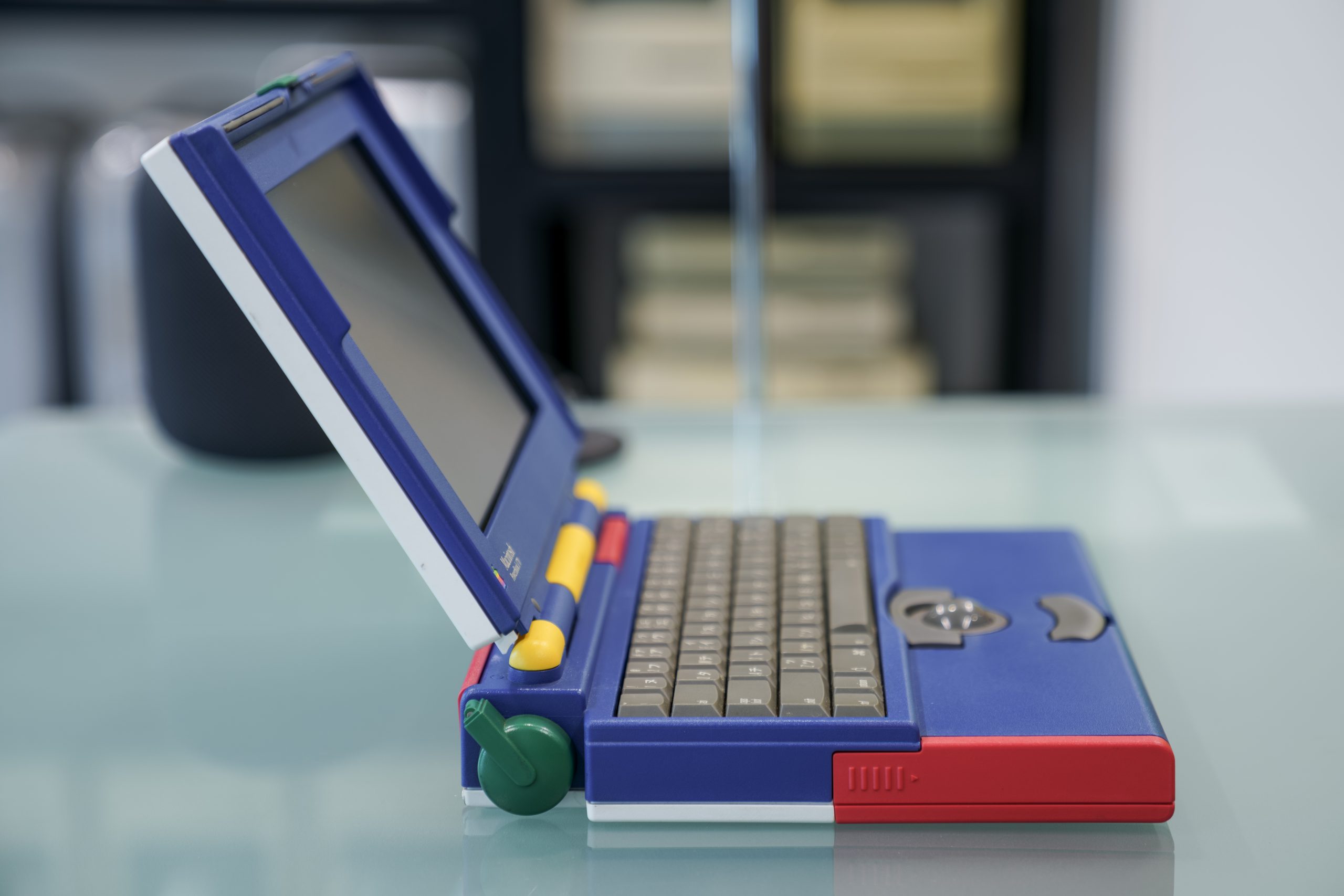
The Macintosh PowerBook 170 “JLPGA” special edition

Apple was one of the sponsors of the 1992 Japanese Ladies PGA golf tournament, and to commemorate this they released a limited edition of the PowerBook 170 with a unique color scheme. I have been unable to find any first hand accounts of the history of this machine, but it is generally understood that approximately 500 of these PowerBooks were made in this unique color scheme

I’ve seen it mentioned in several places that perhaps fashion brand United Colors of Benetton was involved in the design as one of the other sponsors of the golf tournament. I have been unable to verify this, but the similarities in the color scheme of this PowerBook and their brand colors is unmistakable.

Color scheme of the fashion brand United Colors of Benetton
Brand colors of United Colors of Benetton.

Other than cosmetic differences, this special edition was just like any other PowerBook 170 except for two details: it has a Japanese/English keyboard and came with 8MB of RAM instead of the standard 4MB. The power adapter, packaging, and other accessories were the standard versions that came with all PowerBook 100 series laptops.

I found this particular PowerBook 170 “JLPGA” for sale in Japan and jumped on the opportunity to buy it for three main reasons: it was cosmetically in very good condition, it was working, and the asking price was almost half of what they usually sell for on eBay. I’m very pleased with my purchase and I think it makes a very cool addition to my collection.

I have a few other Macs in my collection that were specifically targeted at the Japanese market, or only sold in Japan: the Color Classic II, PowerBook 550c, and the PowerBook 2400c. I’m still on the look out for the elusive Apple II J-Plus!

My  Collection

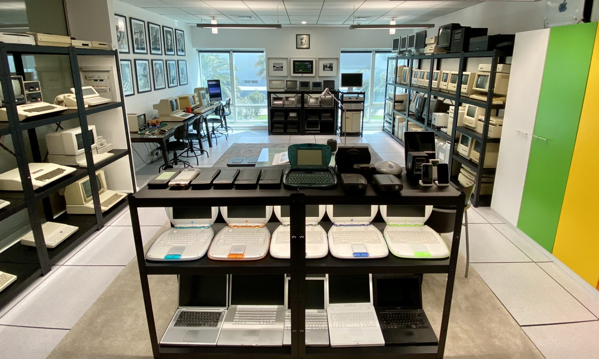
Overview photo of Jimmy Grewal’s collection of vintage Apple computers

This post contains a list of the vintage Apple products currently in my collection. This list does not include smaller accessories such as keyboard, mice, modems, etc. I will update this post from time to time to reflect new additions.

Apple I, II, III
Apple-1 (NTI)
Apple-1 (Mimeo-1 replica)
Apple-1 (Newton-1 replica)

Apple II (Rev. 0)
Apple II (Rev. 3)
Apple II+
Apple II+
Apple III
Apple IIc
Apple IIc
Apple IIc
Apple IIc Plus
Apple IIe
Apple IIe Platinum
Apple IIGS (Woz Limited Edition)

Apple Lisa
Apple Lisa 1
Apple Lisa 2

Classic Macintosh
Macintosh 128K
Macintosh 128K
Macintosh 512K
Macintosh Plus
Macintosh SE (prototype)
Macintosh SE
Macintosh SE (FDHD)
Macintosh SE/30 (prototype)
Macintosh SE/30
Macintosh Classic
Macintosh Classic II (prototype)
Macintosh Color Classic
Macintosh Color Classic II

Macintosh II
Macintosh IIcx (prototype)
Macintosh IIcx
Macintosh IIci
Macintosh IIfx
Macintosh IIsi

Macintosh LC (Prototype)
Macintosh LC
Macintosh LC II
Macintosh LC III

Macintosh Quadra 700
Macintosh Quadra 900
Macintosh Quadra 800

Power Macintosh
Power Macintosh 6100
Power Macintosh 7100
Power Macintosh 7500
Power Macintosh 8600
Twentieth Anniversary Macintosh
Power Macintosh “Power Express” (prototype)

Power Mac G3/G4/G5
Power Macintosh G3 (desktop)
Power Macintosh G3 (mini-tower)
Power Macintosh G3 (blue & white)

Power Mac G4
Power Mac G4 Cube
Power Mac G4 Cube
Power Mac G4 (QuickSilver)
Power Mac G4 (MDD)

Power Mac G5

Developer Transition Kit (Intel)
Developer Transition Kit (Apple Silicon)

Mac Pro (2008)
Mac Pro (2008)

iMac/eMac/mini
iMac G3 (Bondi Blue)
iMac G3 (Raspberry)
iMac G3 (Tangerine)
iMac G3 (Graphite)
iMac G3 (Flower Power)
iMac G3 (Snow White)
iMac G4 (15-inch)
iMac G4 (17-inch)
eMac
iMac G5

Mac mini (G4)
 
Laptops
Macintosh Portable
Macintosh PowerBook 100
Macintosh PowerBook 170
Macintosh PowerBook 170 JLPGA
Macintosh PowerBook 165
Macintosh PowerBook 165c
Macintosh PowerBook Duo 230
Macintosh PowerBook Duo 280c
Macintosh PowerBook 520
Macintosh PowerBook 540c
Macintosh PowerBook 550c
Macintosh PowerBook 5300cs
Macintosh PowerBook 1400cs
Macintosh PowerBook 3400c
Macintosh PowerBook 2400c

Macintosh PowerBook G3

Macintosh PowerBook G4 (Titanium)
Macintosh PowerBook G4 (12-inch)
Macintosh PowerBook G4 (17-inch)

iBook G3 (Blueberry)
iBook G3 (Tangerine)
iBook G3 (Graphite)
iBook G3 (Indigo)
iBook G3 (Key Lime)
iBook G4

MacBook (Core 2 Duo - Black)
MacBook Pro (17-inch)

Servers
Networks Server 500
Power Mac G4 Server
Xserve (Intel)
Xserve G5 Cluster Node
Mac mini Server (2010)

Handheld Devices
Newton MessagePad
Newton MessagePad 110 (transparent case)
Newton MessagePad 120
Newton MessagePad 130
Newton MessagePad 2000 (2100 upgrade)
Newton MessagePad 2100
eMate 300

iPhone (2G)
iPad
iPhone 4

Printers
SilentType
Dot Matrix Printer (Lisa)
Dot Matrix Printer Wide Carriage (Apple ///)
Daisy Wheel Printer
ImageWriter
ImageWriter (new in box)
ImageWriter Wide Carriage (new in box)
Color Plotter (new in box)
Scribe
LaserWriter Plus
ImageWriter II
ImageWriter LQ
LaserWriter IINT
Personal LaserWriter SC
StyleWriter

Monitors
Sanyo VM 4209 (Feb 1977)
Sanyo VM 4209 (Nov 1977)

Monitor III
Monitor II
Monochrome Monitor IIe
AppleColor Composite Monitor IIe
IIc Flat Panel Display
Monitor IIc 
AppleColor RGB Monitor (IIGS)

High-Resolution Monochrome Monitor
Macintosh Portrait Display
AppleVision 14 Display
Apple Studio Display (15-inch)
Apple Studio Display (15-inch Blueberry)
Apple Studio Display (15-inch Graphite)
Apple Studio Display (17-inch ADC)
Apple Cinema HD Display
Cinema Display (20-inch DVI)
Cinema Display (23-inch DVI)
LED Cinema Display (24-inch)
LED Cinema Display (27-inch)
Thunderbolt Display

Peripherals
Scanner
Color OneScanner 600/27
QuickTake 100
QuickTake 150
QuickTake 200

ProFile (5MB)
ProFile (5MB)
Macintosh Hard Disk 20
Hard Disk 20SC
AppleCD SC
Apple Tape Backup 40SC
PowerCD
Xserve RAID

DuoDock
DuoDock

Bandai Pippin
Apple Interactive TV Settop Box
Apple TV

AirPort Base Station

Internet Explorer 5 for Mac: twentieth anniversary

Internet Explorer 5 Macintosh Edition logo textToday (Jan 5th, 2020) marks the twentieth anniversary of the introduction of Microsoft’s Internet Explorer 5 Macintosh Edition (MacIE 5). This was both the most important release of Internet Explorer for the Mac and the last. It was also the first large third-party Mac application to ship for Mac OS X, and the first mainstream web browser to embrace standards compliant web content.
This anniversary is also significant for me as MacIE 5 was first product I worked on when I started working at Microsoft in summer of 1999. I was 22 years old and I was thrown into the deep end of the browser wars, the Microsoft anti-trust trial, and the love/hate relationship between Microsoft and Apple. I don’t want to delve into the details of what made MacIE 5 special because my friend Tantek Çelik has already documented that on his blog. Rather I want to focus on the inside story of how and why it was developed, and some of the people and personalities that shaped it’s success and eventual demise.

I’ve just posted a Twitter thread that goes into some details bout the events leading up to and just after the unveiling of MacIE 5 by Steve Jobs:

I also want to share a detailed history of MacIE 5’s bold UI design, dubbed “New Look” internally. This history has been compiled by Maf Vosburgh, the developer who conceived and executed the implementation of this major UI redesign:

New Look : How I set the look of Mac IE 5, possibly kickstarted Aqua (sorry), and invented translucent blurred windows, in the 1990s.

Maf Vosburgh, January 2020, California

In the summer of 1998 I moved from London to San Jose, California to write code for Mac IE 5 at Microsoft. I was supposed to go work for Apple in Cupertino, but the Apple recruiter screwed up my offer paperwork, and Microsoft snapped me up.

I should explain that my background was at a BBC spinoff called “MMC”, coding Mac multimedia software for CD-ROMs like “3D Atlas” and Douglas Adams’ “Last Chance to See”. I was used to working with graphic designers. I’d do a rough prototype, they would do a beautiful image of how it really ought to look, and after a bit of back and forth we’d have a lovely product. MMC started off using tools like HyperCard supplemented by our custom plug-ins, but by the mid-90s we had switched to native code and never looked back.

Coming from the artist-influenced multimedia world, the visual style Microsoft had in progress for Mac IE 5 looked ancient to me. Everything was the MacOS platinum style, shades of gray like cement, with a horde of tiny 16 by 16 pixel toolbar icons (in 4-bit color with a 1 bit mask) most of which had obviously been designed by engineers in a pixel editor like ResEdit.

Meanwhile, Mac hardware of the 1998-1999 era was incredibly vivid, with first the Bondi blue iMac and then a whole palette of iMacs in translucent candy colors with white pinstriped elements. I had posters of them on my office wall. Eventually the whole Mac range had this same vivid design style, and the gray drab interface of MacOS 8, which we matched, seemed left behind. Apple’s demos at the time of their future OS would (which came to be Mac OS X) also used this same gray look. We were building a state-of-the-art new HTML engine for IE 5 (Tasman) and I wanted the chrome to be as modern.

I had the idea of making our browser chrome match the actual hardware you were on. If your Mac’s bezel was Bondi blue, we’d make our UI Bondi blue. That way our “frame” around the web page would match the bezel and so would be seen as part of the background and be distinct from the content. By being more vivid we would paradoxically blend into the background, and look more at home.

I put my idea to the rest of the Mac IE team, and they loved it. We had no graphic artists in our little office in San Jose and I suggested we hire a company called Nykris back in London. Nykris was a digital design company founded by two artists I’d previously worked with at MMC, Nikki Barton and Chris Prior (their first names combined to make the company name) and they had other great people on staff who I trusted, like Graham Bartram.

So somehow the Mac IE5 exec, Dick Craddock, let me, a newly hired engineer, hire a London design agency and I ended up art-directing on our side while also writing the new UI code to make it happen.

Nykris came up with a range of fascinating design sketches, but the sketches that followed the original idea of coordinating with the flavors of the new Apple hardware look, worked the best, and so we followed that path.

Gradually through Spring 1999 a design emerged that started to look like Mac IE 5 as it turned out. Shiny simple button shapes, pinstripes (a 3 pixel repeat made the pattern fine enough to not hurt readability, although it was inconvenient to code).

Mac IE lead, Steve Falkenberg, worked out how to make the system scroll bars match whatever color scheme we were using. He also worked out how to auto-detect what flavor of Mac we were on.

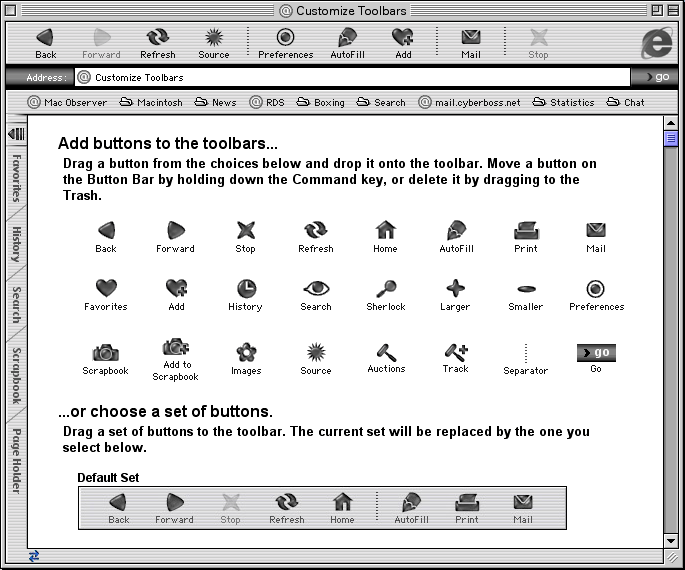
Program Manager, Jimmy Grewal, worked out an elegant UI for customizing toolbar layouts, which has been much imitated since.

Nykris totally redesigned how the tab strip looked and also came up with the idea of the toolbar being able to collapse INTO the tab strip down the left hand side. This gained back lots of vertical screen estate, valuable on the small screens of the day.

As Nykris sent me artwork from London, I was working out how to implement the designs in San Jose, without slowing IE down or using too much memory.

New Look was so secret that it was not in the daily Mac IE 5 builds that our QA and external beta testers were using, so everything had to be switchable on and off with a NEW_LOOK build macro and leave no trace in the regular beta builds, which continued to look like Mac IE 4.x. As I was changing a lot of UI code, keeping both builds working was tricky.

The big 24 bit icons and 8 bit masks with switchable “flavors” had to work in the same memory as the old toolbar system. The new tab code was all custom and everything had to be drawn anti-aliased (lines and text).

It rapidly came together and in Summer 1999 we demoed the secret New Look build of Mac IE5 to Steve Jobs, the first person to see it outside Nykris and a few people on the Mac IE team. Steve gave it his enthusiastic approval. Yeah!

So eventually MacWorld January 2000 came along, the venue for unveiling the Mac IE 5 beta.

Steve Jobs insisted on doing the Mac IE 5 demo himself. Tnis is where things got a little surprising. Steve first showed a new build of Mac OS X which had a new user interface called “Aqua”. This looked, well, just like the Nykris design we’d been using for half a year at that point.

He then demoed IE 5 by showing an experimental Carbon port of it on Mac OS X, and said the UI look was being inherited from the operating system (it was not – Mac IE 5 looked just the same on Mac OS 8 or 9 at the time).
Oh well, that was Steve being Steve.

So did Steve see our Summer 1999 New Look demo and tell his team to create Aqua? Who knows. Our stuff was in any case inspired by Apple’s hardware designs, so I can’t feel too bad about it.

A side note about blurred translucent windows.

Mac IE 5 launched in March 2000 with a blurred translucent autocomplete window, the first time this blurred translucent window thing was ever done. That look is everywhere right now, so people might want to know how that came about.

In the summer of 1999 I had one last big idea. The big white autocomplete window that came up under the address bar as you typed, was bothering me. It covered a lot of the web page, and the page is the star of a web browser. It felt to me like this window was hiding the context of where you are. I wrote a version of the window that made the window translucent (not trivial on MacOS 8), but the readability of the overlayed text was bad. I tried changing the tone of the background image to make it a better background, which was an improvement but still not there. Then I had the idea of also blurring the background content. After all, the eye is used to interpreting sharp foreground objects against the blurred stuff in the background, like reading letters on a shop window. This was an effect that people were used to seeing in pre-made Photoshop artwork but not something that anyone has used realtime as a live effect.

At the time, Gaussian blur was something you’d only do in Photoshop which required a lot of memory and didn’t do it very quickly. Macs did not have the kind of hardware acceleration that modern machines have, in fact most had no actual GPU.

I knew I had to write a Gaussian blur routine that took no noticeable time, used very little memory (even on a large image), and worked on any depth of content. Back then, people ran their Macs in all kinds of color depths, with 8 bit being still common.

The actual magic I came up with involved a bunch of secret programming tricks and math shortcuts and eventually I had a virtually instant blur routine that could process any pixel depth image and tonally adjust the image at the same time. In goes a picture, out comes a picture you can put black text on top of and easily read it.

I could tell once I had the right values dialed in. You could recognize the web page in the background, it felt as if you hadn’t gone anywhere, but you could read the 1990s style 9 pt aliased black type layered on top with virtually no added difficulty. The blur filtered out the high-frequency information from the background and the tonal shift gave you the contrast you needed to read the text.

The Mac IE 5 release of March 27, 2000 included that blurred translucent autocomplete window, despite some management indecision about it because the look was at the time so revolutionary. Later than year I added the effect for conxtextual menus too. Of all the UI stuff I’ve come up with over the years, this has been the most significant in retrospect. It was a key design element of Windows Vista and now iOS and the Mac. Although they almost never get the recipe right. You need blur and toning, either lightening for black text overlay or darkening for white text, and there shouldn’t be so much of either that you lose context.

Unfortunately, the Carbon port of Mac IE on Mac OS X never got the blurred translucent window code (the skeleton crew who finished the Carbon port instead used Mac OS X’s built-in translucency without blur which is not the same thing at all).

I want to extend a special thanks to my friends Tantek, Maf, Dick, Kevin, and Bertrand for refreshing my memory on the events of twenty years ago. I look forward to sharing more anecdotes about the development of MacIE 5 and the relationship between Microsoft and Apple during those years.

Light L16 review follow-up: real estate photography

A quick follow up on my review of the Light L16 digital camera…I think it’s a great option for real estate photography. It’s compact (the best camera is the one you have on you), it generates very high resolution images, and it’s wide dynamic range (WDR) feature produces some compelling results without the hassles of HDR photography.

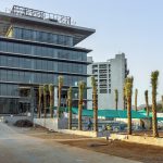
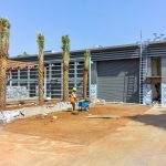
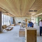
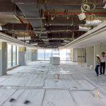
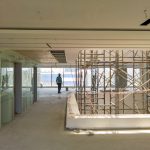
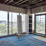
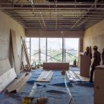
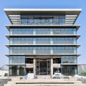
I’ve been working on the design and construction of Elcome India’s new corporate headquarters in Mahape (outskirts of Mumbai) since 2015. Though the project has taken a year longer than planned, we are in the final stretch and look forward to occupying the building by Q4 of this year. I visited the construction site this week and took the following photos with the L16. As you can see in the gallery below, I was able to recover a lot of detail from the highlights in the interior photos with only single exposures in Auto mode…no exposure bracketing and merging required.

Light L16 camera review

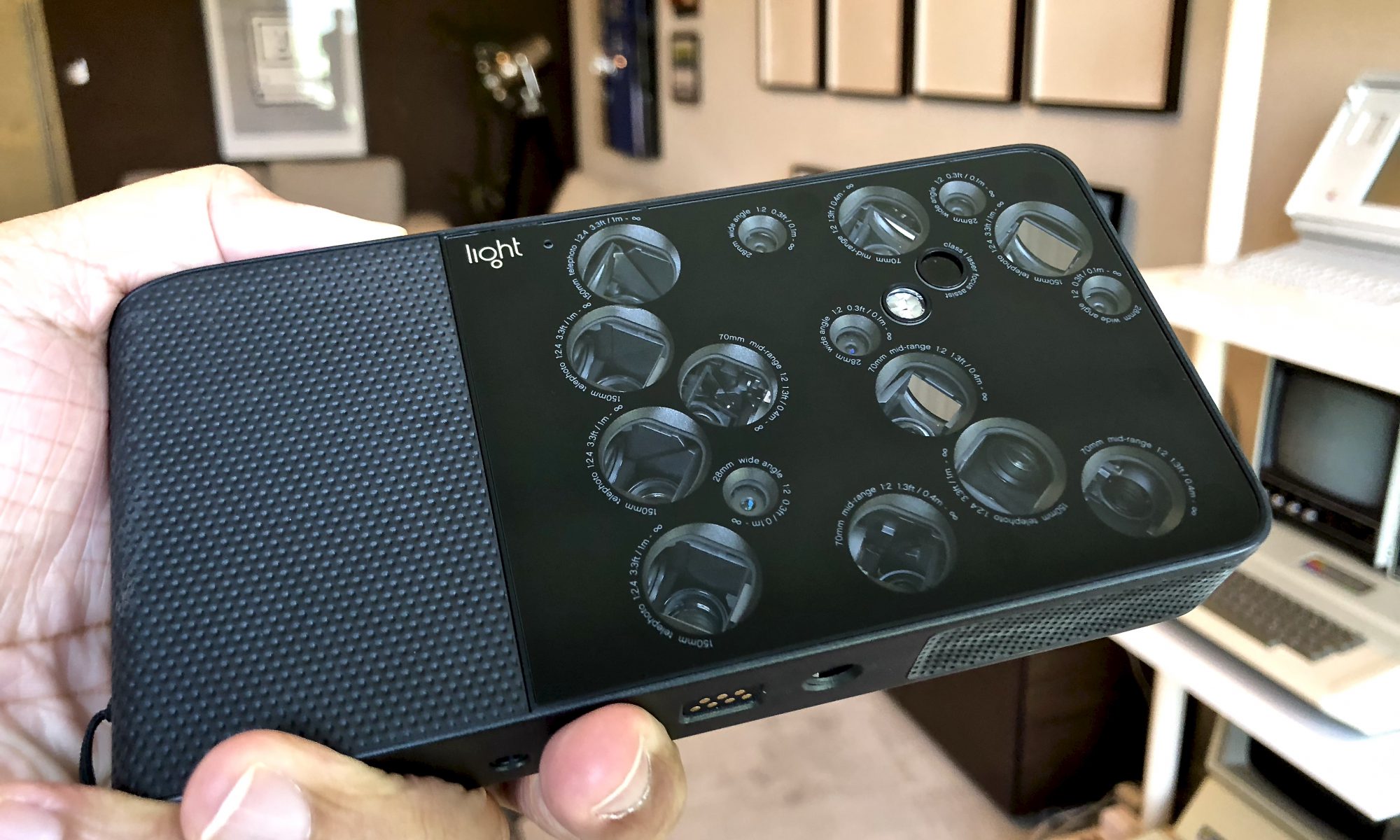
Light L16 camera in hand

For the past six months I’ve been using the Light L16 camera. I first learned about and preordered this camera in October 2015, and after a two year wait finally got my hands on it.

Let me start by saying that the L16 does not yet support video recording, direct uploading to social media, sharing to iOS devices, high dynamic range (HDR) photos, exposure bracketing, optical image stabilization, and some other features found on high end DSLR and smartphone cameras. Many (but not all) of these features are promised in future software updates.

The camera has quite a few limitations and is best suited to early adopters who are willing to put in the time/effort to get the most out of it. Having said all of this, I like it and have decided to keep it. More importantly, six months down the road I’m finding myself using it more and more. Here’s why.

Introduction

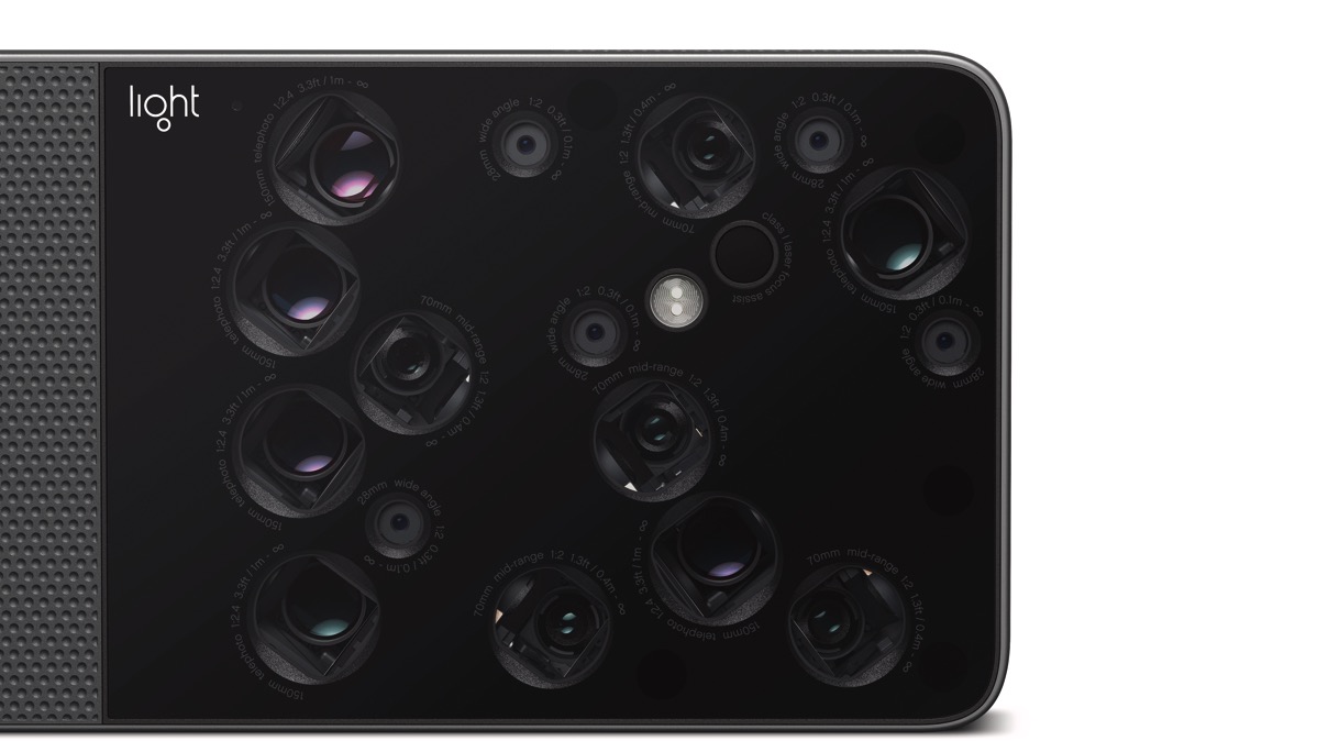
The L16 is more closely related to a smartphone than a traditional digital camera. It is an Android based device with sixteen mobile phone grade camera sensors (13 megapixels each) each with their own lens of varying focal lengths (28mm, 70mm, and 150mm). The camera combines up to ten of these sixteen sensors to produce a photo.L16 lens close 001 4K 3840x2160

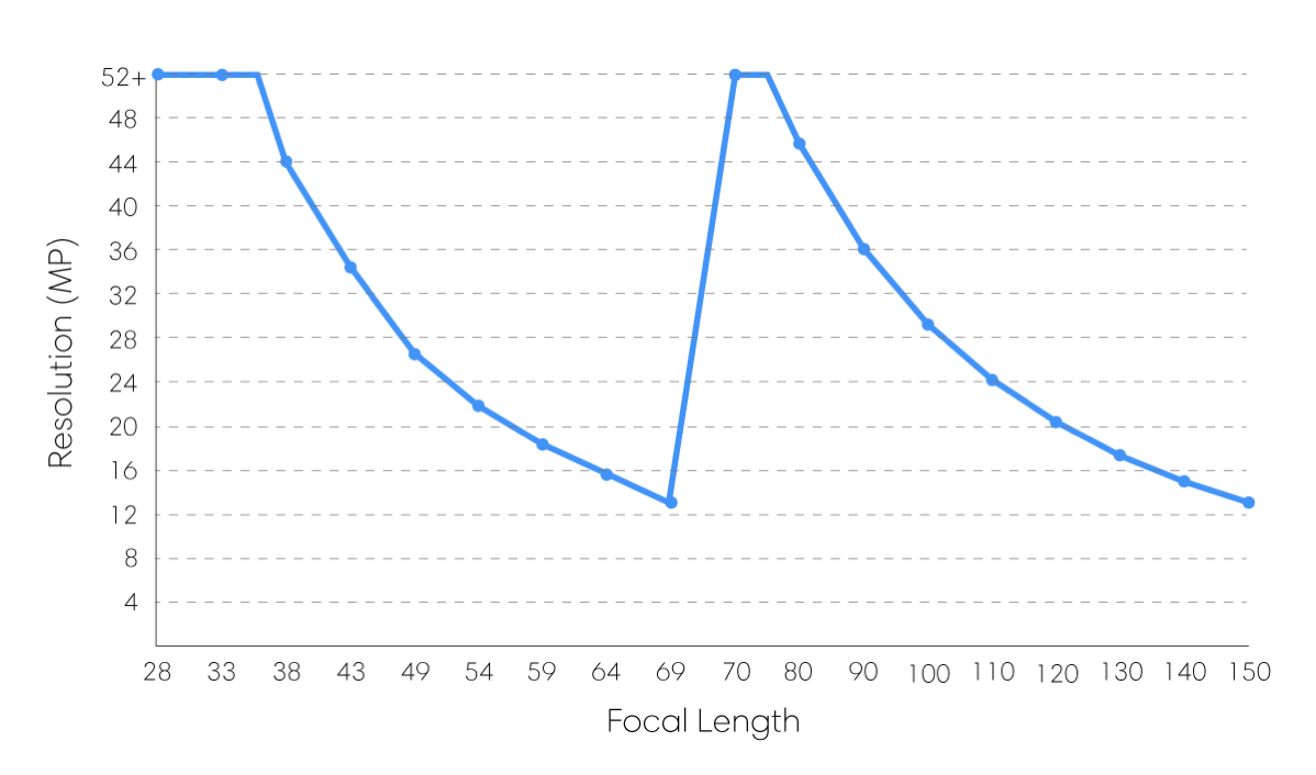
Depending on the focal length you select, the camera generates an image of between 13-80 megapixels. The “prime” focal lengths are 35mm, 75mm, and 150mm where you get the sharpest images with minimal interpolation. At 35 & 75mm, you get images of approximately 52 megapixels. More information on this variable resolution is available on the Light website.

Graph Variable Resolution 1200pxW

The L16 is a computational camera, meaning that the photos it captures are generated by software algorithms processing data collected by its sensors. This means that it’s performance depends on the quality of camera firmware and image processing software. The hardware obviously doesn’t change, but it’s software changes frequently unlike traditional digital cameras. With each software update the functionality, image quality, reliability, and performance of the camera changes (hopefully improving).

The L16 today

Today, the L16 is a product with solid hardware and beta-quality software. Not all features work as advertised, the camera has some bugs related to capturing images, the desktop software is changing rapidly and requires significant CPU performance, and it’s not yes seamless to capture and share images online. Having said that, if you are willing to overlook these issues and put in the effort to post-process images after they are captured, the camera can produce some amazing results.

Light Lumen Desktop software screen shotLight L16 DNG image detailsL16 Images & Workflow
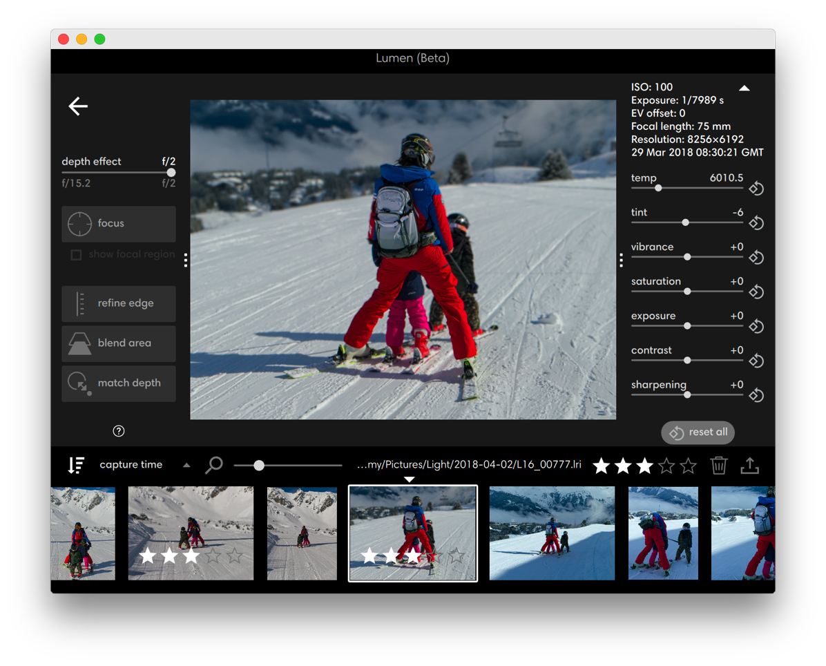
Lumen is used to combine the multiple exposures the L16 captures and provide some controls over how that happens and do some basic edits to the final image. The camera captures images as a LRI (Light Raw Image) file, which is basically a container that includes the images captured by each sensor and some metadata to aid merging.

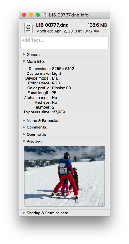
You can output your image at various resolutions and in either JPEG or DNG format. In my case, I always elect to output full resolution DNGs that I then edit further in Lightroom. To the left you can see the file details for a typical full resolution DNG outputted from Lumen.

In my case, my workflow involves Lumen, Lightroom, and Apple Photos. From Lightroom I output 16-bit TIFF files with Display P3 colorspace that are then pulled into Photos as my main photo management tool. The challenge is the large amount of storage space that each image takes: approximately 200MB RAW + 150MB DNG + 230MB TIFF = ~580MB total disk space per image for my workflow. I plan to implement an AppleScript to automatically archive the LRI and DNG files once I’ve processed my final image.

As mentioned earlier, processing L16 images in Lumen is quite CPU intensive. I use it on both my 2013 Mac Pro (3.5 GHz Intel Xeon E5, 6-core) and a 2016 MacBook Pro (3.3 GHz Intel Core i7, dual-core). Exporting full resolution DNG files can be a very time consuming process that maxes out all cores on my machines. I haven’t had a chance to test Lumen on a machine with a larger number of cores (like the 2017 iMac Pro with an 18-core Xeon), but I suspect that the process will benefit from being able to parallelize the export process across a larger number of cores. I don’t anticipate that Light can do much to speed up this process beyond a certain amount.

Taking Photos with the L16

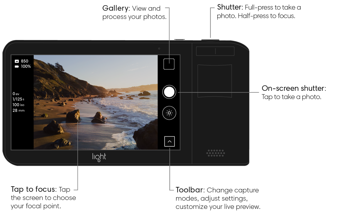
The process of taking photos with the L16 is similar to that of a modern smartphone, but with additional options tailored to more professional users. The L16 has a nice touchscreen on the back that is used to compose the shot and adjust camera settings. There are two main parts to the software: a photo capture function and an image gallery.

At a Glance Photo 1600pxW

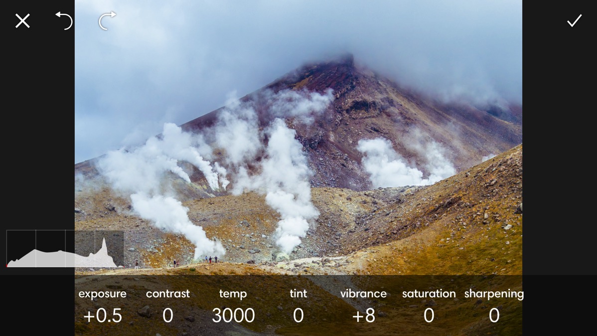
The camera currently supports the following capture modes: automatic, ISO priority, shutter priority, and manual control. It also has a self timer, burst mode, white balance adjustment, and exposure compensation adjustment. In the gallery view, you typically see a low resolution preview from one of the ten sensors used to capture the image. You can optionally generate a higher resolution preview in-camera that combines images from five sensors. Aperture adjustment is currently done in Lumen and by default all photos are captured at the equivalent of f15. There are basic photo editing tools in-camera
Light L16 in-camera photo editing tools

It can be a bit frustrating at times to not have hardware buttons for zoom, but the camera body does have touch sensors that appear to be for this purpose that are yet to be enabled in software. I hope this happens soon. Currently zoom is achieved by swiping your finger up and down over the preview image.

One drawback of the touchscreen is that it’s not bright enough when shooting outside in bright sunlight. The camera itself is not waterproof or splash resistant, and the touch screen doesn’t always respond to touch inputs if there are drops of water on the screen.

Is it a good camera?

After detailing the features and drawbacks of the L16, I want to talk about what is probably most interesting and relevant to anyone reading this review: is it better than modern smartphone cameras? Sometimes.

If I’m taking regular photos of my family and daily life for sharing on Instagram or other social media, I prefer to use my iPhone X. If I’m taking photos that I might use in other ways that benefits from more resolution, photos that would benefit from greater zoom, or photos of complex scenes with both bright and dark elements, and when I have time to process the resulting images on my computer, then I prefer to use the L16.

Let me give you a specific scenario in which the L16 was the best camera for the job: skiing. On a family ski holiday last month to Courchevel, I wanted to have a camera that fit into my ski jacket, had sufficient zoom to take compelling portraits and landscapes, and enough resolution to display at larger sizes. My other camera (iPhone X, Leica Q, Panasonic LUMIX FZ1000) were not suitable and the L16 performed admirably.

I was able to capture good photos in challenging conditions: cold, very bright, not easy to compose shots, limited space in my jacket pocket, multiple falls without being damaged and without damaging me. My iPhone X could have been used for some of these shots, but many times it lacks sufficient zoom and resolution to take quick photos and then crop to desired size later. With almost 4x the resolution and optical zoom in a pocketable format, the L16 worked out well on this trip.

Another feature of the L16 is the ability to add a depth effect to image, similar to the Portrait mode on the iPhone X, after the image is taken. You can adjust this depth effect to emulate a depth-of-field down to f2. Here is an example of the original image and the same with depth effect applied:

Courchevel Skiing Photo no depth effect
Original image (f15)

Courchevel Skiing Photo
Depth effect applied (f2)

As is the case with the iPhone X’s Portrait mode, the L16 depth effect is not perfect and often requires using editing tools in Lumen to correct errors. I’ve not been able to get the hang of those tools, so I use the depth effect sparingly. I’m spoilt by the f1.7 aperture on my Leica Q and so most simulated depth-of-field effects don’t look very appealing to me.

Other areas where the L16 excels is landscape, urban, and architectural photography. It’s compact size means that it’s more likely to be with you when you see something interesting, and it’s resolution and optical zoom gives you flexibility to frame your phone quickly. Another feature is the impressive detail that can be recovered from the highlights and shadows…rivaling professional DSLRs in some cases. This is because the current version of the L16 software includes a wide dynamic range (WDR) feature that underexposes one of the sensors when capturing a scene. The DNG file brought into Lumen can recover a lot of detail from highlights as a result, and you can safely expose photos for the shadow areas knowing that blowout highlights are not as much of a problem as typical cameras. A simultaneous HDR mode is promised for a future software update.
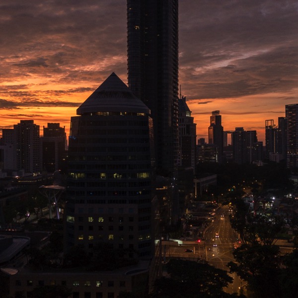
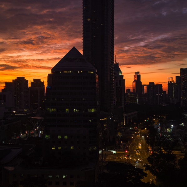
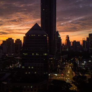
The resolution when capturing photos is apparent in this comparison of an iPhone X HDR photo vs. the L16 WDR photo of the same scene (sunrise in Singapore):

iPhone X HDR photo of Singapore at SunriseLight L16 WDR photo of Singapore at Sunrise

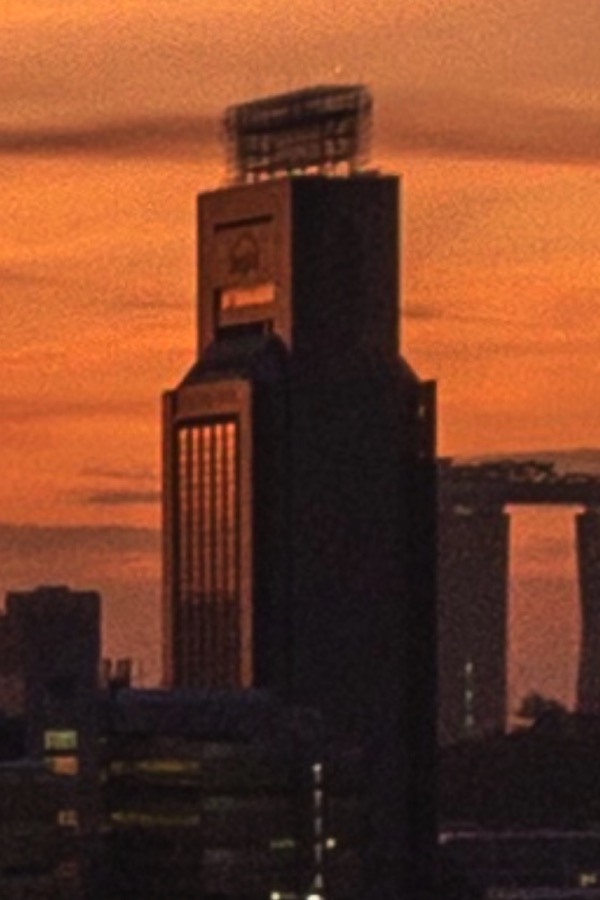
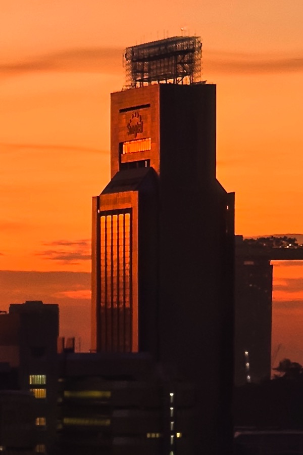
And here is the detail available from each camera when you zoom in on the SingTel building in the background:

Crop of SingTel building captured with iPhone XCrop of SingTel building captured with Light L16

Not only is there more detail in the L16 photo on the right, but far less noise. At Instagram image sizes you can’t really appreciate these details, but when you look at the two photos on a large computer monitor, 4K TV, or large print you can definitely see the difference.

There are two situations where L16 image quality needs improvement: high ISO (above 1,000) and certain focal lengths where more interpolation is required. The lack of optical image stabilization makes the low light noise problem a bigger issue than on other cameras. If you can use a tripod or place the camera on a flat surface, it’s possible to get clean low-noise photos by using ISO priority mode and setting it to 100 or 200. Handheld, the iPhone X performs noticeably better at low-light photography.
Show me the goods!

OK, enough chit-chat and let me show you some of the photos that I’ve taken over the past six months with the L16 so you can judge it’s quality yourself by looking at my collection L16 albums on Flickr. You can pixel-peep at the full resolution images there, but I’ve included some at the end of this post.

The blog is back

After a twelve year hiatus triggered by technical issues (my hosting provider went bust) and laziness (my site backups were not up-to-date), I’m back. For the past decade or so I’ve been using a combination of Twitter & Facebook as my “blogging” platforms, but they each have their limitations…so it was time to rescue my old blog with the help of the Internet Archive and recover all my old posts. Now that’s done, I’m looking forward to posting here and sharing insights with my millions of loyal followers.

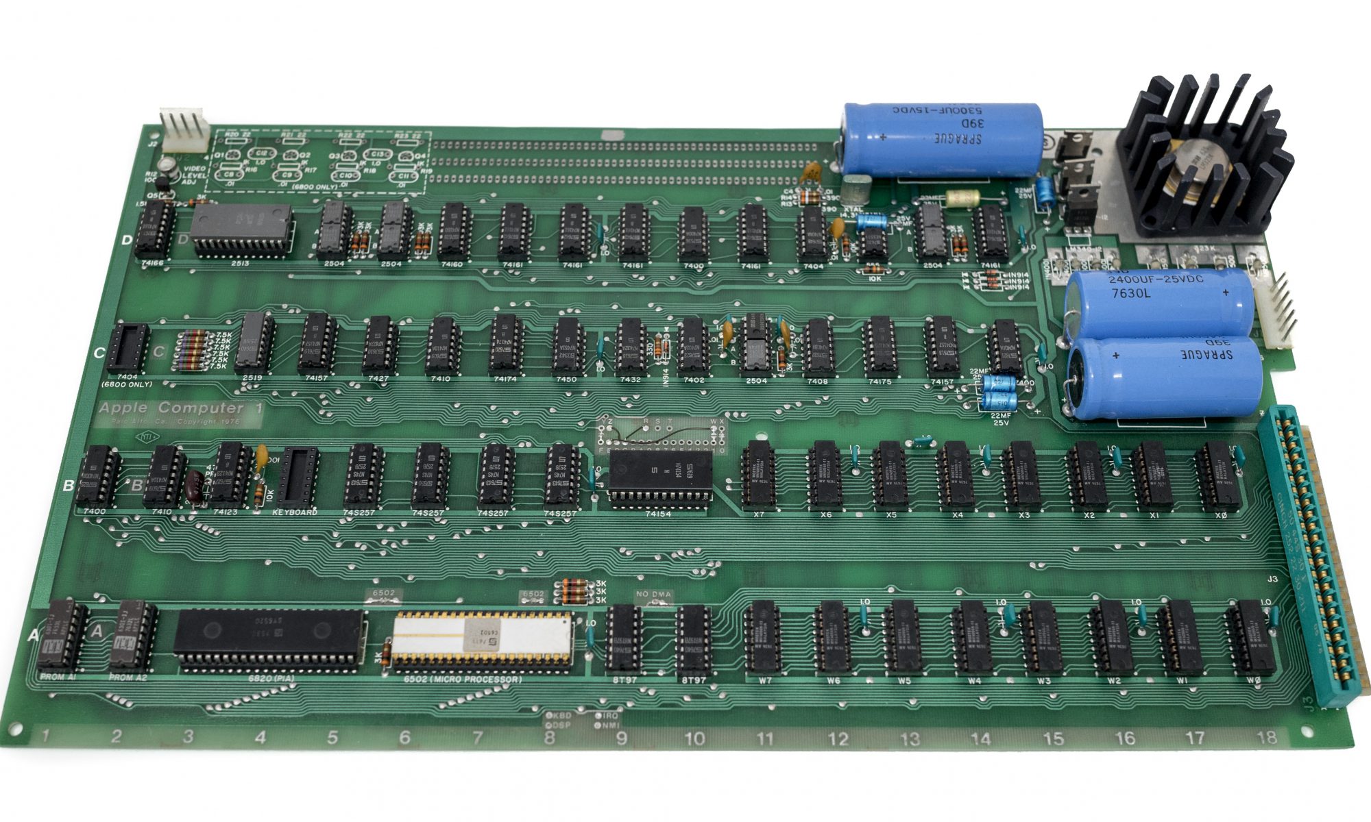
Apple Computer 1

A few weeks ago I became the proud custodian of an original 1976 Apple-1 computer. I collect vintage Apple computers, and for collectors like me the Apple-1 is the holly grail. I’ve been on the lookout for one for more than 20 years and the stars finally aligned to make acquiring one possible.

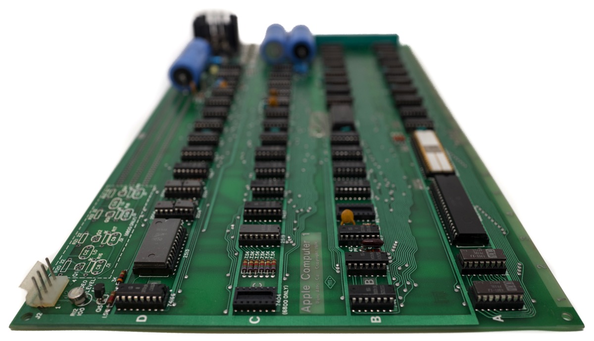
Apple-1 board

The Apple-1 was not a commercial success, with less than 200 units sold in just over one year; but it was the reason that the Apple Computer Company (as it was known at the time) was founded and was pivotal in Apple securing venture capital to develop the Apple ][, it’s first mass market personal computer.

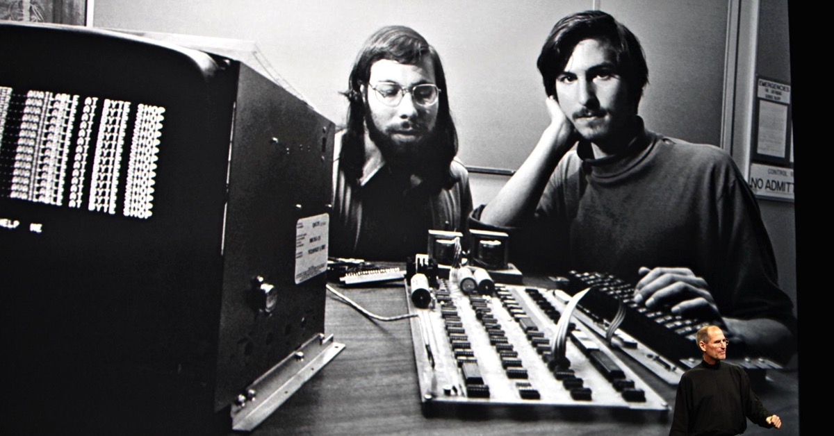
Steve Jobs keynote screen grab

The story of how the Apple-1 came to be is well documented, but the individual histories of the ~200 Apple-1s that were manufactured are a little less clear. Luckily, there is an excellent online registry of original Apple-1 computers, originally created by Mike Willegal and now maintained by Achim Baqué. My Apple-1 is listed as #67 on the registry. There is also a dedicated Apple-1 online forum for owners and enthusiasts at Applefritter.com.

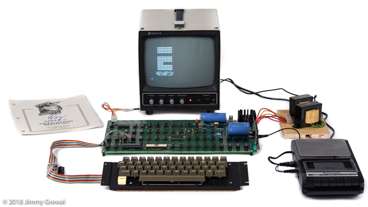
The Apple-1 was sold as a fully assembled motherboard in a cardboard box. The chips on these boards were hand populated by Steve Jobs’ family and friends in his parents’ house. They were then taken to the garage where they were tested, and repaired if necessary, before being shipped to a handful of retailers in the US who sold them. The Apple-1 did not come with a case, keyboard, monitor, data storage device, or transformer. It was up to the retailer or the buyer to source off-the-shelf components to complete a working systems that would have typically looked like this:

Assembled Apple-1 system

In recent years, the value of Apple-1 computers as increased significantly with recent auction prices averaging in the $350-$500k level and as much as $900k. My focus, due to budget constraints and not being totally bonkers, had been to acquire the “runt of the litter” so-to-speak and leverage the excellent PCB repair ability we have in-house at Elcome to restore it. Here’s a video documenting the process of restoring this particular Apple-1 to working condition:

We got lucky with this board. Underneath a coat of grime and sticky residue was a pristine & unmodified board that we were able to get working without replacing any of the original components. Due to the age of the components, I don’t plan on powering up this Apple-1 a lot, but it’s actually good for it to be used every couple of months to prolong the life of the capacitors. There’s not a whole lot you can do with the Apple-1 compared to the Apple ][ or modern personal computers, but we’re working on an IP interface to make it easier to load software rather than the present method of using audio files or typing them manually. Having previously assembled a couple of Apple-1 replicas allows us to experiment more easily.

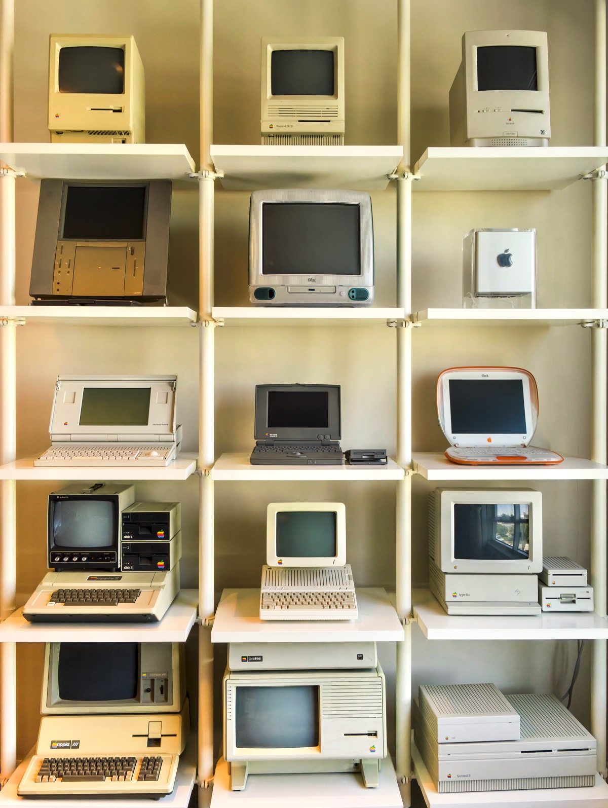
The Apple-1 basically completes my collection of vintage Apple computers. I have my favorites from my collection displayed in my office: some out in the open and others a bit more discretely.

Jimmy Grewal's vintage Apple computer collection

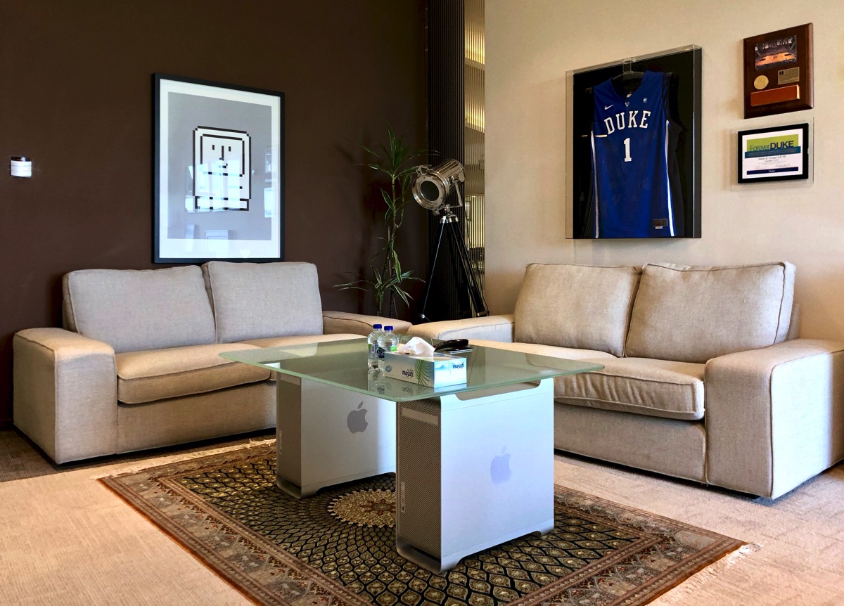
PowerMac Table photo

I plan to put together a blog post about each of the computers in the wall display above at a later date…hopefully before the decade is out. I’ve owned some since they were new, and others were acquired specifically for my collection. I haven’t yet figured out how I’m going to display the Apple-1 in my office…I’m saving that as a summer project.

My longterm plan is to partner with a public venue, like a museum, to display this Apple-1 so that anyone can see it and learn about it, the people who created it, and the technological revolution that it sparked. Until I find a permanent home for it, I’m exploring sending it on tour for temporary display at smaller museums…once I sort out all the insurance, transport, and import/export issues involved.

If you have any questions about this Apple-1 feel free to reach out on Twitter.

Pulse: hello world!

For the past few months this blog has been very quiet; that’s mostly because I’ve been busy trying to get a new project off the ground. This is something I’ve been working on since I left Microsoft back in 2003, but it has taken time and some mistakes along the way to build the company and product that I wanted.

Pulse logo

I’m pleased to announce the launch of the Pulse family of residential and hospitality automation products and the company behind it, Aspalis SAS.

Aspalis was formed in December last year as a partnership between myself and my friend Laurent Nicq. Laurent and I met in 2004 while he was working for a company called ConvergeX which was building Windows Media Center based home automation software. When that company had severe financial trouble and laid off most of its staff, Laurent and I decided to partner and build our own company and hire many of the talented engineers which ConvergeX let go.

Thus, Aspalis SAS was born and is now based in scenic Sophia-Antipolis, just outside of Nice and Cannes in the south of France. Besides myself and Laurent, we have five other talented people working with us: Jean-Paul, Emmanuel, Baptiste, Lucas, and Thomas. Aspalis is working closely with Navicom Technologies FZCO, a Dubai-based company in which I’m also involved, to bring products based on Aspalis software to market in the Middle East and the rest of the world.

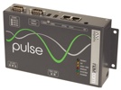
Pulse ControllerThe first of these products is the Pulse Controller. This device acts as a central monitoring, control, automation, and remote management gateway for various systems in the home. At present, this device is designed to interact with hardware using the KNX / EIB and Z-Wave protocols; we will be adding support for additional protocols and standards in the future. Basically, the Pulse Controller interfaces with lighting, HVAC, curtain/shutter, IP cameras, and other devices/systems in the home to present the user a unified view on what’s going on around them.

The end user interacts with the Pulse Controller via client software running on a range of devices:

  • In-wall touch screens running Windows Embedded CE 5.0 or 6.0 with the .NET Compact Framework installed
  • Personal computers running Windows XP and Vista, including a special version for UMPCs
  • Mobile devices such as Windows Mobile 5.0 PocketPC and Smartphone connected via a WWAN connection such as GPRS/EDGE/UMTS/HDSDPA/etc
  • In the near future we will add support for clients based on Vista Media Center, Mac OS X, Symbian, and the .NET Micro Framework.

Pulse Client on HTC S620We have worked hard to build a simple and consistent user interface which adapts to the unique characteristics of the device it is running on. It’s hard for me to describe what I’m talking about, but we hope to post a Flash based demo that you can play with on our website sometime early next year.

The Pulse Controller itself is also a mini-computer, but is totally customized to suit the unique requirements of the market we are targeting. First and foremost, the hardware and software inside the Pulse Controller is designed to be reliable and easily serviceable. The hardware is based on industrial-grade embedded technology and features an Intel IXP420 Network Processor running at 400 MHz. At present, it runs Windows Embedded CE 5.0 Core, but we are evaluating CE 6 for future versions. The blocking issue at the moment is the lack of a suitable BSP.

The Pulse Controller is manufactured for us by Kontron Modular Computers GmbH on top of their E2Brain platform and the entire system is fully CE certified. We are in the process of getting FCC certification as well. The Pulse Controller has 64MB of SDRAM and 32MB of flash storage. It has two serial ports, two USB 2.0 ports, and two 10/100 Ethernet ports. There is space inside for an RF module, which presently occupied by a Z-Wave module available in 868.42 or 900 MHz versions. KNX / EIB support is enabled by way of a Siemens BIM 113 module which allows direct connection to a wired EIB bus. The device accepts 10 to 33 volts DC, and consumes around 4 watts during normal operation. It’s very compact and comes with both wall and DIN rail mounting brackets.

In addition to making it reliable and delivering easy-to-use client software, one of our most important goals was to design a solution which scaled well. By this I mean that we want to offer home automation for even the largest residential/hospitality projects out there. In order to do this, you have to design a solution which can be monitored, controlled, and updated remotely. We have built some configuration and deployment tools already, but have also included full support for monitoring and control of the Pulse Controller via SNMP. A white paper detailing this capability will be posted shortly.

In summary, the Pulse Controller and associated products have some unique selling points:

  • Reliability. The hardware and software was designed from the ground-up to be reliable and easy to service.
  • Scaleability. We have developed the first home automation solution which can be deployed in large residential or hospitality projects in the same way networking or communications equipment is used.
  • Cost. We have not taken the traditional “kitchen sink” approach, but rather focused on delivering a solution which has some basic/essential features and does those things well. We’ll leave the flashy/gimmicky features to all the other guys.
  • Openness. We like making friends. By leveraging protocols such as EIB and Z-Wave, we allow our dealers and installers to design solutions which best suit their customer’s requirements. We also play nice when it comes to client devices and are open to integrating the Pulse Controller with front-end software from others.

So, what’s next? We just finished exhibiting at the Gulf Information & Technology Exhibition (GITEX) in Dubai, thanks to the kind folks at Intel who gave us some space at the last minute. Next week we’ll be at Cityscape 2006 in Dubai starting on December 4th. We will be on the Al Shafar General Contracting stand. In early January, we’ll be making our North American debut at CES in Las Vegas. More details on that shortly.

If you are interested in learning more, watch our website or this blog and we’ll have more information about where you can buy home automation systems incorporating our products and technologies. Our initial focus is on new homes, but the Pulse Controller can also be used in existing homes.

I’m really proud of the work my team has done over the past year, and I am confident that we have carved ourselves a viable niche in the home automation market. The architecture we have developed makes it easy to adapt to changing market requirements and we have already begun work on future generations of the existing product and new products as well.